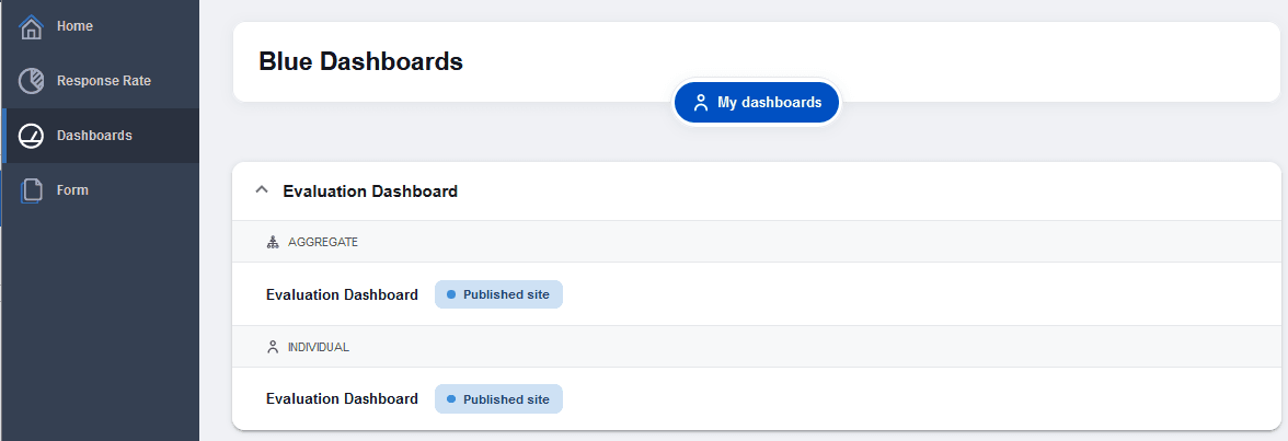
View the aggregate dashboard
The aggregate dashboard is the space to analyze results at the organizational level or per unit level. With core statistics, trend analyses, comparisons, and smart confidentiality filtering, stakeholders in every level of the organization can safely explore and make data driven decisions based on the available data.
The aggregate dashboard determines what data set is available to you based on your role in the organizational hierarchy as defined by the Blue administrator. The primary subject data that can be accessed by the user will load by default.
- Questions - Blue questions are the questions created within a project. The Blue Dashboard pulls single selection, single selection table and comment questions from projects in Blue.
- Dashboard Questions (DQ) - A DQ is a question that appears in the dashboard and maps across many projects as a question that makes up one part of a question group.
- Question group - A question group is a group of Dashboard Questions that focus on a single central theme, such as communication skills, course structure, or quality of learning. This can be referred to as an area, theme, competency, or KPI. Data can be spread across a number of projects, over a period of time, and among various subjects, but ultimately the resulting data is presented together to provide valuable insights.
- Time scale - Meaningful time periods that can be established by the administrator to best represent the operations of their specific organization. For example, an administrator could define Spring 2016 as taking place from January 20, 2016 through April 30, 2016.
- Threshold - In an effort to ensure that specific feedback cannot be traced back to a specific user, minimum response thresholds have been created for both subjects, and respondent demographic data.
Dashboard landing page
- Log in to Blue.
- Navigate to Blue Dashboard.
- Select the link for the aggregate dashboard. The aggregate dashboard will open.
Aggregate dashboard header section
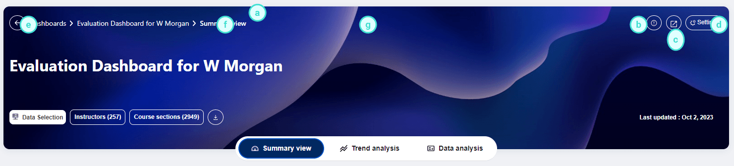
a. Follow the breadcrumb to easily find where you are in the dashboard.
b. Select the (i) icon to display the legend information.
c. Pop-out the Dashboard in a new tab or window.
d. Edit the settings menu to customize the dashboard to your liking, select statistics to display, change the order of the views.
e. Data selection supplements standard filters by supporting more powerful filtering capabilities, such as complex filters, exclusion of certain records, and visual representations of the organizational hierarchies.
f. Export the aggregate dashboard raw response data in a set of CSV files which can be used in third party analytics tools.
g. Switch between the available views.
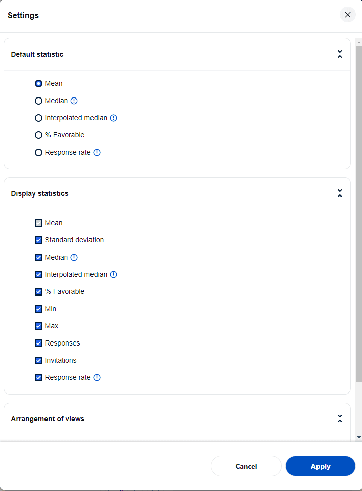
Settings menu
The settings menu will pop-up allowing users to select the default statistic that will appear in the dashboard and add or remove additional statistics from the dashboard. Users can also choose the order of the views. Changes made to the settings are saved to the user preferences and will be remembered when the user returns.
Default statistics and display statistics
Select the default statistic that will appear in the dashboard and add or remove additional statistics from the dashboard.
The default statistic is the statistic that all of the trend charts and subject summary details initially load. The display statistics can be enabled or disabled. The disabled statistics will not be available on the dashboard views.
It is important to note that using the median or interpolated median as a statistical measure for a group of questions is generally not appropriate. If you select either of these measures for a group of questions, the resulting value will be calculated as if all the questions in the group were combined into one question.
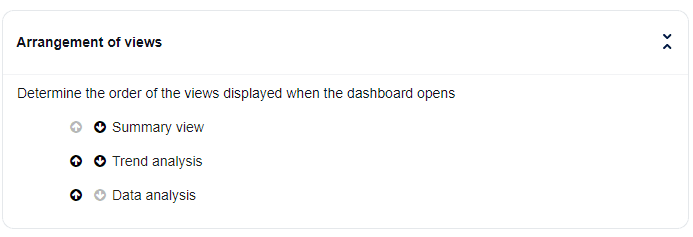
Arrangement of views
Use the up and down arrows to determine the order of the views displayed when the dashboard opens.
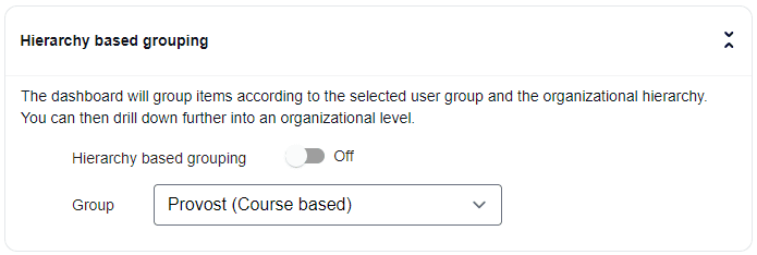
Hierarchy based grouping
The hierarchy based grouping feature enables easier digestion of large amounts of information by breaking it down into smaller, more manageable chunks. This feature automatically determines the next level of items to display during drill down navigation, allowing users to navigate through layers of aggregated data before reaching a specific subject's detail. By default hierarchy based grouping is enabled, but users do have the option to disable it.
If a user belongs to multiple dynamic groups, their highest ranked group from the configuration will be used as the default group for the hierarchy based grouping.
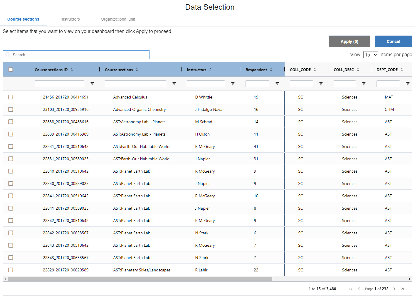
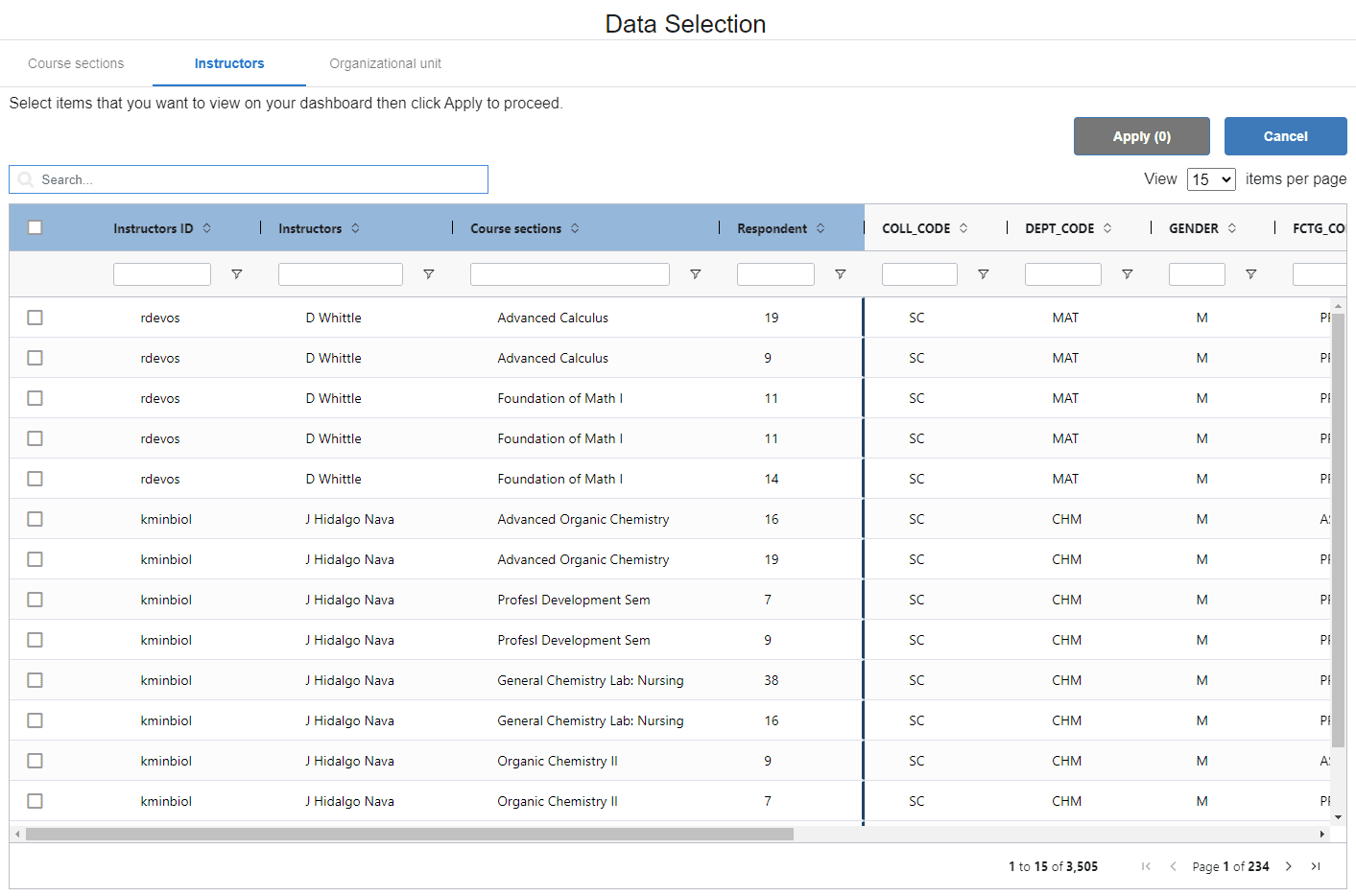
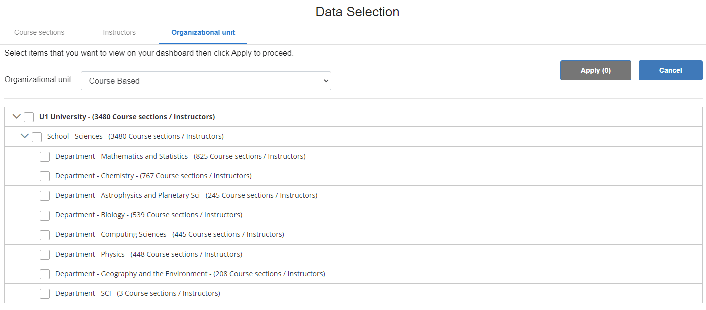
Data selection
In addition to the filters of the analysis menu bar, the Data Selection button supports more powerful filtering capabilities, such as complex filters, exclusion of certain records, and visual representations of the organizational hierarchies
Information can be organized into two types of hierarchies. One is the primary subject based hierarchy and the other is an secondary subject based hierarchy and the Blue administrator has the option to implement one or both of these hierarchies. By default the data from the primary subject is loaded. Use the Data Selection button to load alternative hierarchies.
Select the data to be viewed in the aggregate dashboard:
- Click Data Selection and a window will load with the available data.
- Select the data to be viewed in the aggregate dashboard using one of three methods:
- Filter the list of primary subjects using the available primary subject demographics and then select the desired primary subject/secondary subject pairs to be viewed in the dashboard (if the system is using the primary subject based hierarchy).
- Filter the list of secondary subjects using the available secondary subject demographics and then select the desired secondary subject/primary subject pairs to be viewed in the dashboard (if the system is using the secondary subject based hierarchy).
The data selection features on the end-user page retain the applied filters and unselected records throughout a user session.
- Select the desired organizational units to be viewed in the dashboard.
Dashboard controls
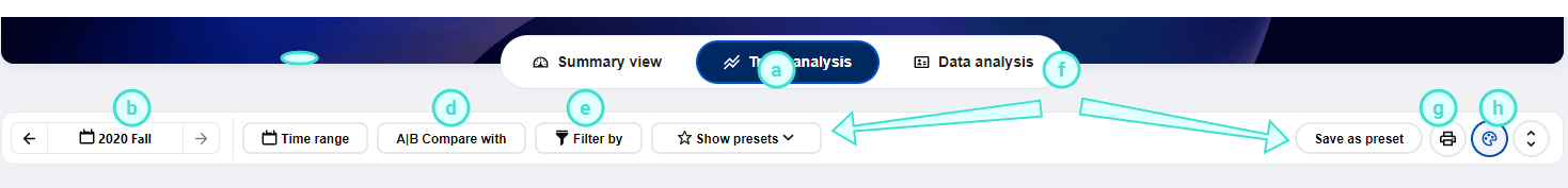
- Switch between the available views.
- Anchor time period - Use the left or right arrow buttons to move the selected time period (i.e. anchor time period that is highlighted on the chart) or jump to a specific time period by clicking the current time period and jump to the new time period.
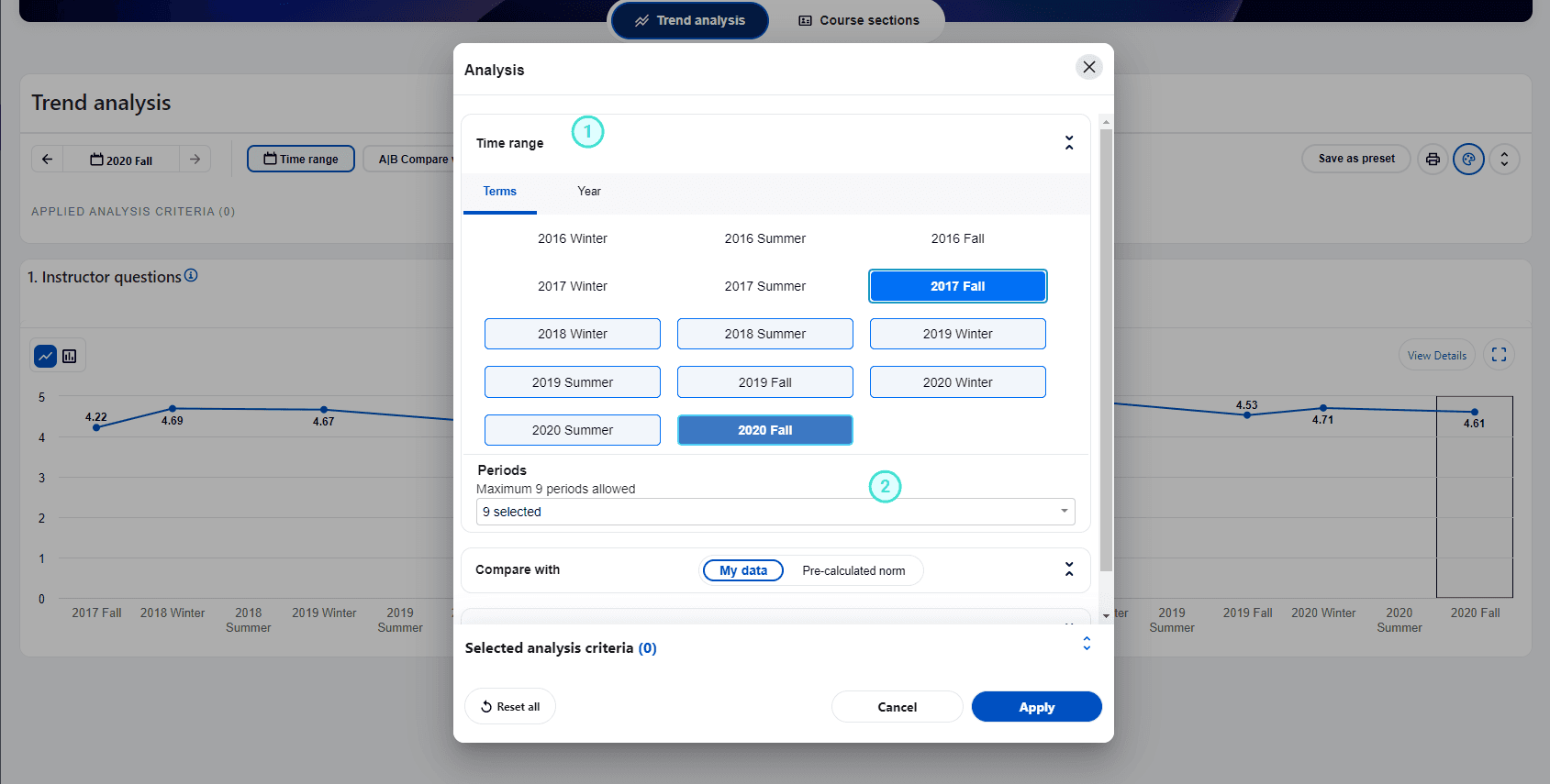
- Time range - (Trend analysis view only) Adjust the time periods being displayed. All data within this time range will be included in the trend charts. A maximum of nine time periods can be selected within a time range.
- Time scale - Multiple time scales can be utilized by the dashboard (i.e. year based time periods, or semester based time periods).
- Time range drop-down - Time periods can be selected or excluded and then Apply must clicked to update the dashboard.
- Time range selection - The user can move the time range forwards and backwards and the range will adjust when you click Apply. Use the mouse to select or deselect a time period. The dashboard is refreshed each time the range is updated.
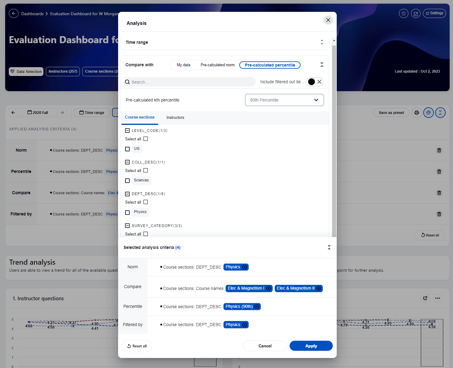
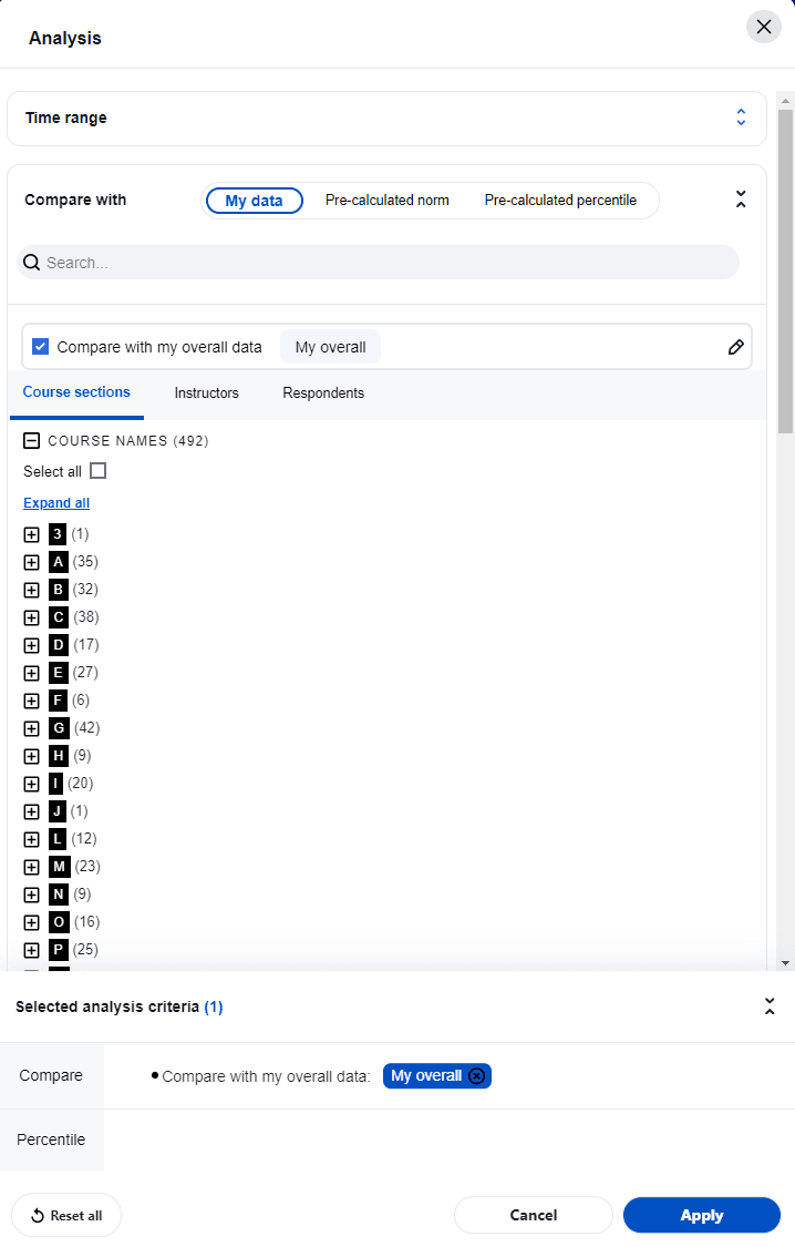
- Compare with - To further discover the hidden insights in the data, the compare feature allows a user to slice and dice the data based upon selected demographic criteria that they want to examine in more detail or measure against a larger entity (i.e. department).
Users can take advantage of the Select all option to choose all available items within a demographic field to include them in the comparison.
- My data:
- Select demographic criteria to breakdown the data set, then click Apply to proceed.
- Please note, the subject names are automatically listed and grouped alphabetically in the comparison criteria.
- Pre-calculated norms: Works just like my data but allows a user to measure their results with a larger entity like a school or department.
- To address data privilege concerns, the norm elements that are available are dynamically determined based on the loaded dataset. For instance, to view the department norm for biology, you must have at least one course that belongs to the biology department.
- Pre-calculated norms remain unchanged by filter criteria.
- Pre-calculated percentiles: Allows users to benchmark themselves against specific percentiles of a school norm instead of just comparing with the school average.
For example, users can determine where they rank among other in the organization. For example, better than 75% of people in their school, even if their score is already above the school average. This addition adds a more nuanced understanding of performance within the context of the larger group.
Note: Pre-calculated percentile is calculated based on the concept of norm across subjects.
- Compare with my overall data: Allows users to view both the overall aggregated data and the breakdowns while comparing them with pre-calculated norms.
- The My Overall caption can be changed to suit your situation. For instance a department chair may rename 'My Overall' to the name of the department
- The calculated data in My Overall is affected by the selected filters.
- Filter by - Select specific subject or respondent demographics to study a subset of the data.
- Select multiple filter criteria across the two dimensions of subject and respondent demographics, then apply them together at once.
- The subject names are automatically listed and grouped alphabetically in the filter criteria
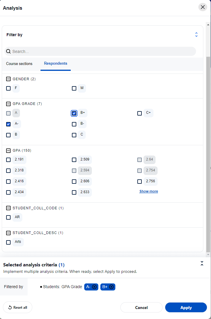
- Streamline filters: Blue Dashboard users can now hide filtered out items on the analysis menu. This feature aims to reduce the burden caused by the extensive list of filter items, given the vast amount of available data. By hiding or disabling filtered out items, users can streamline their analysis criteria and focus on the relevant items.
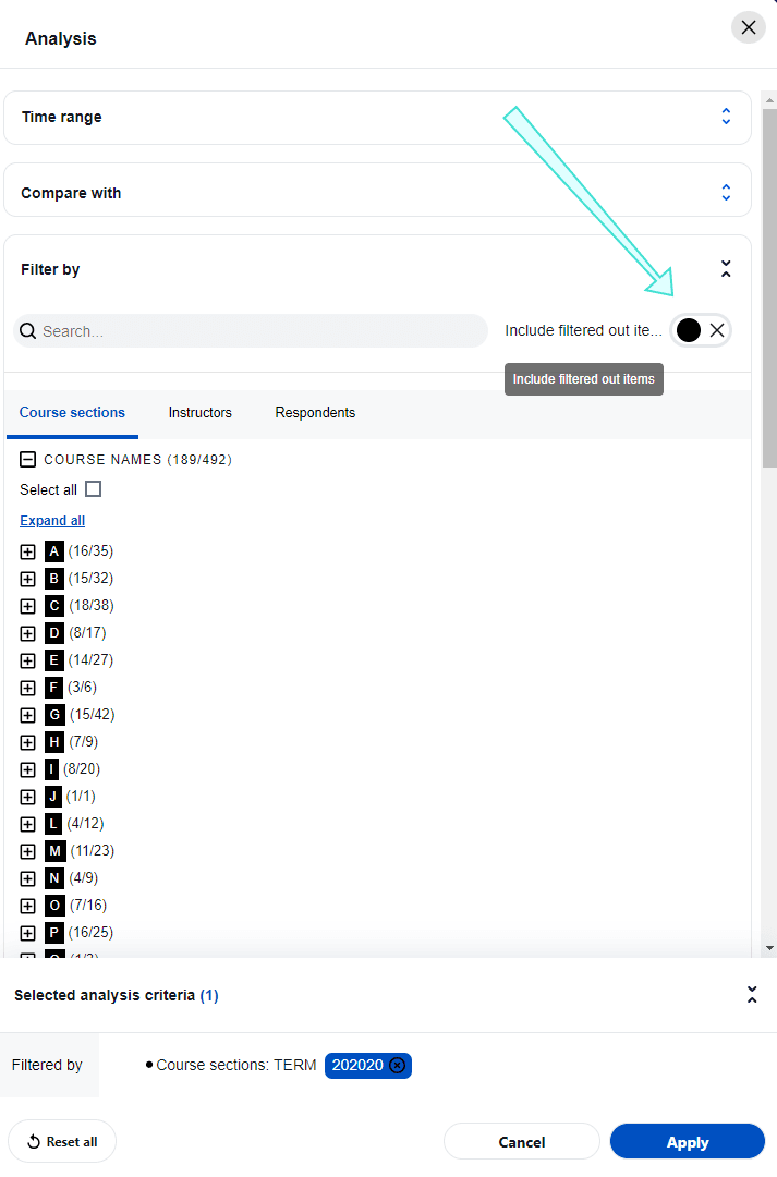
Streamlined filters apply to both filters and comparisons
- Preset
- Save as preset - Clicking the Save as preset will save the current analysis criteria as a preset view with a name you enter.
- Show presets - Select an existing preset view to load.
- Preview the current page for printing
The print preview function is available on several sections of the dashboard including, the trend analysis view, the subject listing view, and the subject details view. If the view is not supported, the print preview icon will not be displayed.
The print preview function will create a print friendly version of the page, the user can then leverage the browser’s built-in print function either to print or to generate PDF files. Both portrait and landscape orientations are supported. Legal, letter, and A4 size papers are supported for the best fit.
- Pattern charts - enable or disable the pattern background in the bar charts. Due to compliance with accessibility standards (WCAG 2.1 AA ), the pattern background is turned on by default.
Summary view
The summary view in Blue Dashboard is an optional view that displays an executive summary, utilizing a list of widgets to highlight key information and provide a summary of events. The widgets on the summary view can be customized by administrators for each dynamic group, and the feature can be enabled or disabled per group to provide flexibility when rolling it out. The three widgets currently available in this release are the score widget, ranking widget (demographics), and score plus trend widget. Each widget can be viewed with different available statistics and some widgets may have different chart types available via the settings menu.
If thresholds are implemented two terms may appear throughout the dashboard:
- (partial) - this will appear when some of the subjects don't meet the minimum thresholds so their data is excluded from that calculation.
- Threshold not met - this will appear when none of the subjects meet the threshold values and therefore that calculation cannot be performed.
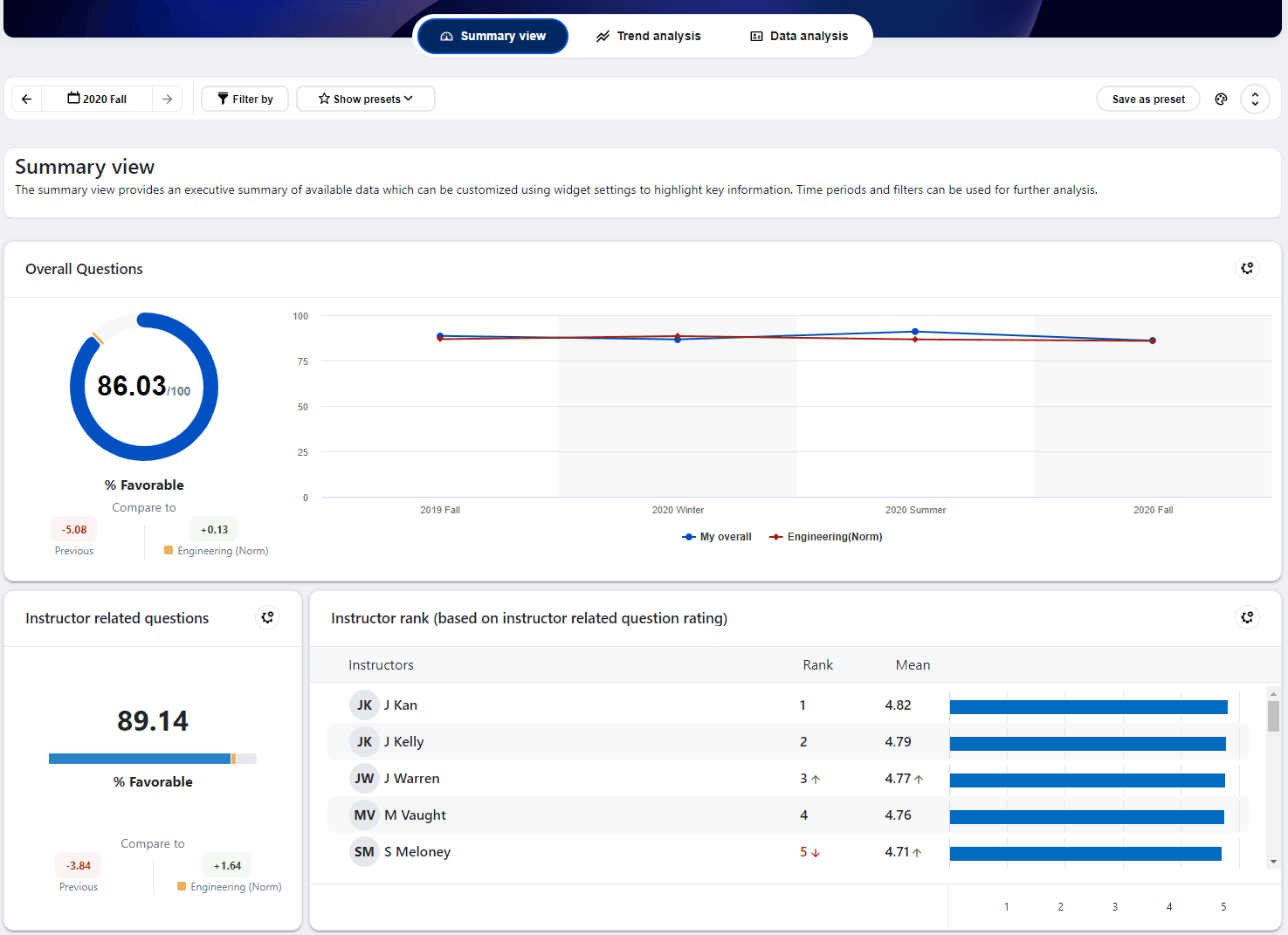
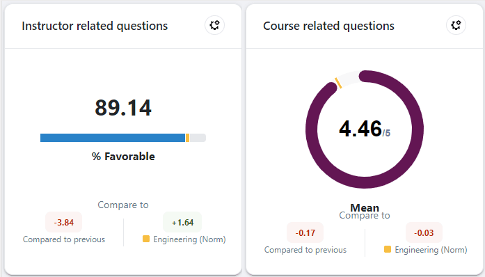
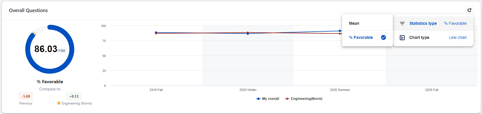
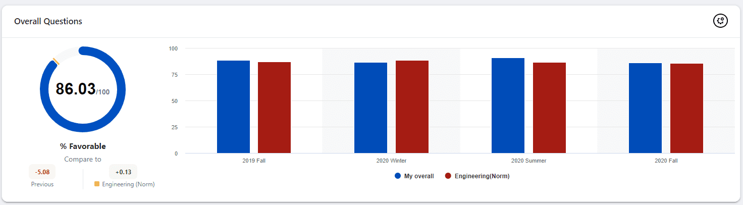
Score widget
Displays a chart containing the score of a question or question group. This widget also includes the change from the previous score and the difference from the pre-calculated norm (optional). Users can change the displayed statistics by selecting different statistics within this widget.
The norm element that is available is dynamically determined based on the loaded dataset. For instance, to view the school norm for engineering, all your courses must belong to the school of engineering. In order to show the norm element you must either load the data from one specific organizational unit or filters must be leveraged to narrow the data displayed to just one organizational unit.
Score plus trend widget
Displays a score widget that also contains a trend chart covering up to the four latest time periods prior to and including the anchor period. A minimum of two periods are required to display the trend chart. The trend chart will contain two sets of data if the norm element is available.
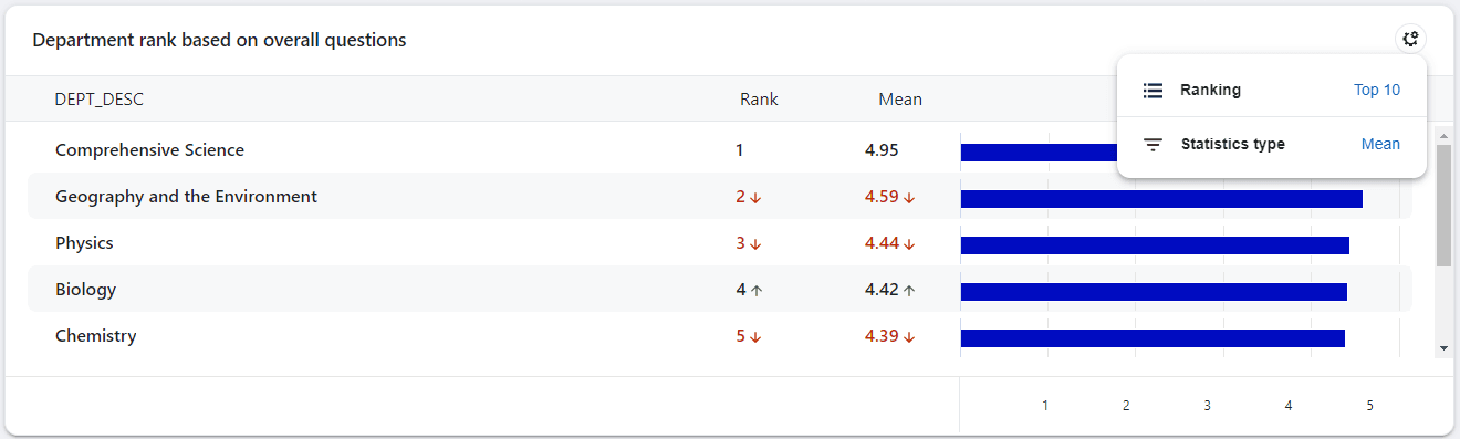
Ranking widget (demographics)
Displays a list of ranked demographic items. These items will be ranked according to the score of a question or question group. Color coded arrows indicate the changes in rank or value from the previous time period. Users can hover over the value to see more details.
Items can be sorted from highest or lowest and a user is able to select the number of items in the widget by changing the options found on the widget. Users are also able to select the statistic they wish to display.
Trend view
Users are able to view a trend for all of the available Question groups. The score for each time period is plotted on a graph. Users can filter, compare, or drill deeper into a data point for further analysis.
If thresholds are implemented two terms may appear throughout the dashboard:
- (partial) - this will appear when some of the subjects don't meet the minimum thresholds so their data is excluded from that calculation.
- Threshold not met - this will appear when none of the subjects meet the threshold values and therefore that calculation cannot be performed.
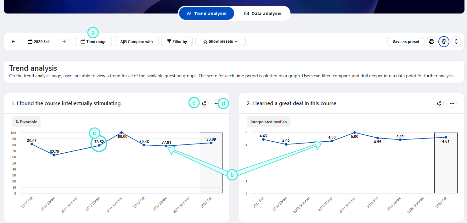
- Time range - Adjust the time periods being displayed. All data within this time range will be included in the trend charts. A maximum of nine time periods can be selected within a time range.
- Time range selection - The user can move the time range forwards and backwards and the range will adjust when you click Apply. Use the mouse to select or deselect a time period. The dashboard is refreshed each time the range is updated.
- Time range drop-down - Time periods can be selected or excluded and then Apply must be clicked to update the dashboard.
- Trend view of the different Question groups within the time range selected.
- Select a node on a Question group trend chart to drill down into a comparison with subjects of the Question group for that specific time period.
- Sidebar menu - Display the same content as the tooltip of a node on the chart, it provides a clearer view of the information of a time period. The side bar is print and pad friendly.
- Settings menu - Enables users to modify how the data is being displayed.
- Chart type - switch between the default line chart and a vertical bar chart.
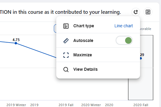
- Autoscale - when this option is enabled the scale of the chart automatically adjusts based on the values in the chart. This option is turned on by default
- Select the minimize/maximize icon to display a full width view of the selected chart or to switch back to a half size chart. When the chart is maximized there is an option to zoom in for more details.
During comparisons on charts, data points often appear concentrated or very close to each other. Even with a maximized chart, it can be challenging to distinguish the differences. To address this, Blue Dashboard now offers a zoom in/out capability for charts. This feature enables users to easily adjust the zoom level and have a clearer view of the data. The zoom feature is available for trend analysis charts and scatter plot charts, enhancing readability and analysis.
- View details - Consult a trend view of all the Dashboard Questions that make up the selected Question group.
- Sidebar highlighted time period - This is the time period corresponding to the information displayed on the sidebar. Use the next and previous time period buttons on the side bar to highlight different time periods.
- Highlighted anchor time period - This is the time period highlighted in the chart based on the selected time period of the entire trend view, aka anchor time period.
- Statistics menu - Choose the statistics to display on the chart.
Data analysis
The data analysis page displays data for all subjects at an anchor time period (use the calendar control to change the anchor period). Data can be viewed in a list view or scatter plot view. Both filters and comparisons are supported on this page.
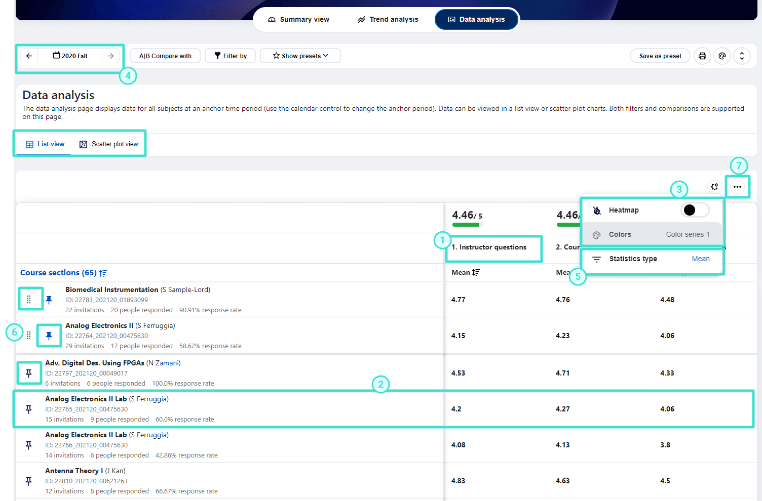
Data analysis - List view
The data analysis list view displays all the subjects for a particular time period (i.e. anchor period) and the default statistic for each question group along with the response rate information. Both filters and comparisons are supported on this page. You can drill down into a specific question group or subject.
Similar to the trend analysis page, the data analysis list view allows users to select a list of items for comparison. This enables users to aggregate their data at any level and compare it with the list of question groups or questions.
- Drill down into a question group
- Drill down into a subject
- Toggle the heatmap on and off
- Change the anchor period
- Choose the statistic being used
- Pin, unpin, and reorder items in the list
- Download data in CSV format
Subjects can be sorted in either ascending or descending order based on the displayed statistic or subject name. Click on a specific subject to open the subject details for that subject. For enhanced convenience during list view comparisons, users now have the option to pin specific items to the top. While other items can be sorted in ascending or descending order, the pinned items will remain at the top of the list view. If multiple items are pinned, users can easily rearrange the order by manually dragging and dropping them.
- The drill-down capability for each subject is disabled when comparisons are being performed on the subject list.
- NPS is only available in the statistics selection list if there are NPS questions. When NPS is the selected statistic type, non-NPS questions will not be displayed.
Data analysis list view - Heatmap
When confronted with a large number of scores on the data analysis page, it can be overwhelming for users to read and understand them. To help viewers quickly identify problematic areas and understand the relevance of a number in relationship to others, Blue Dashboard has implemented a heatmap function with eight available color sets, allowing most users to find an appropriate set to use.
With the available comparison of the pre-calculated norms, overall data, and subject selection, plus the capabilities of the heatmap, sorting, and drill down, a user can quickly identify patterns or correlations in large data sets.
Blue Dashboard offers the flexibility for end users to create their own custom color sets in addition to the built-in 8 color series of the heatmap. This customization enables the heatmap colors to adapt more effectively to specific business use cases that require specific colors for particular datasets.
Color sets can also be based on the ranges of pre-calculated percentiles. This feature enables users to highlight items that fall within a specific percentile range, such as highlighting items in the 80th percentile of the population within a specific business unit like a department or division.
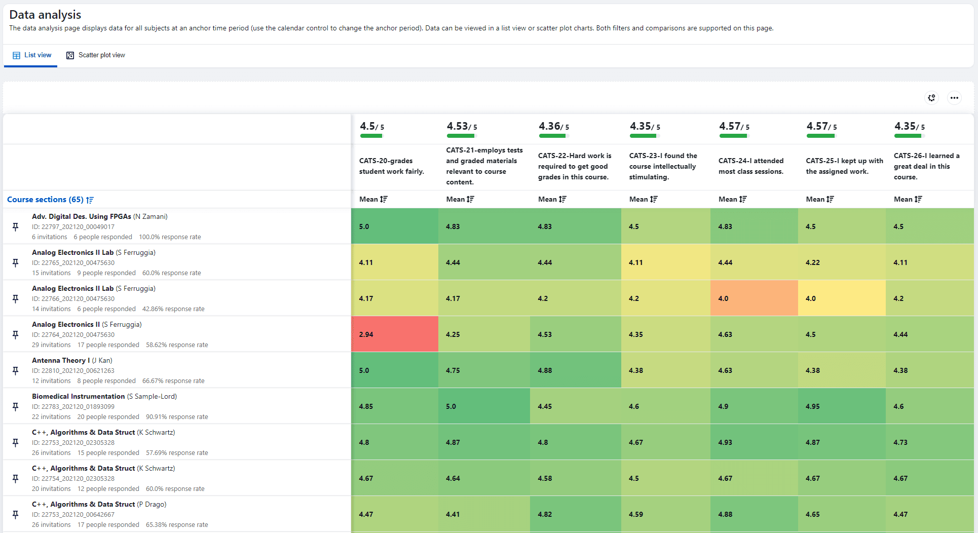
- The default color series for each column in the heatmap are calculated based on the values in that column, so the same number in a different column may not be assigned the same color on the heatmap.
- The heatmap is not available for print preview.
Data analysis - Scatter plot view
The scatter plot view provide a unique capability for insight discovery, allowing users to utilize the scatter plot chart to identify potential trends, patterns, or correlations between two variables.
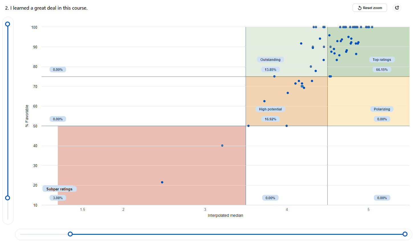
The scatter plot view supports up to two X-axis dividers and two Y-axis dividers, dividing the scatter data into specific areas and indicating the percentage of data allocated to each area.
- Hovering over each scatter dot on the chart displays corresponding statistics such as response count, mean, median, and more.
- Additionally, when the scatter plot displays a set of primary subjects, clicking on a dot representing a subject (course) allows users to drill into a detailed view for that subject.
Scatter plot settings menu
The settings menu provides the following options:
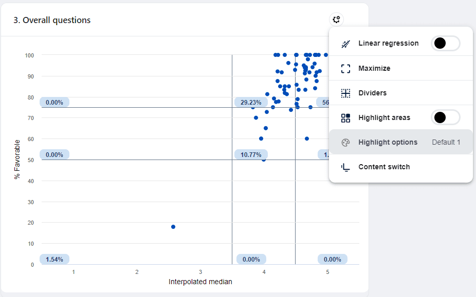
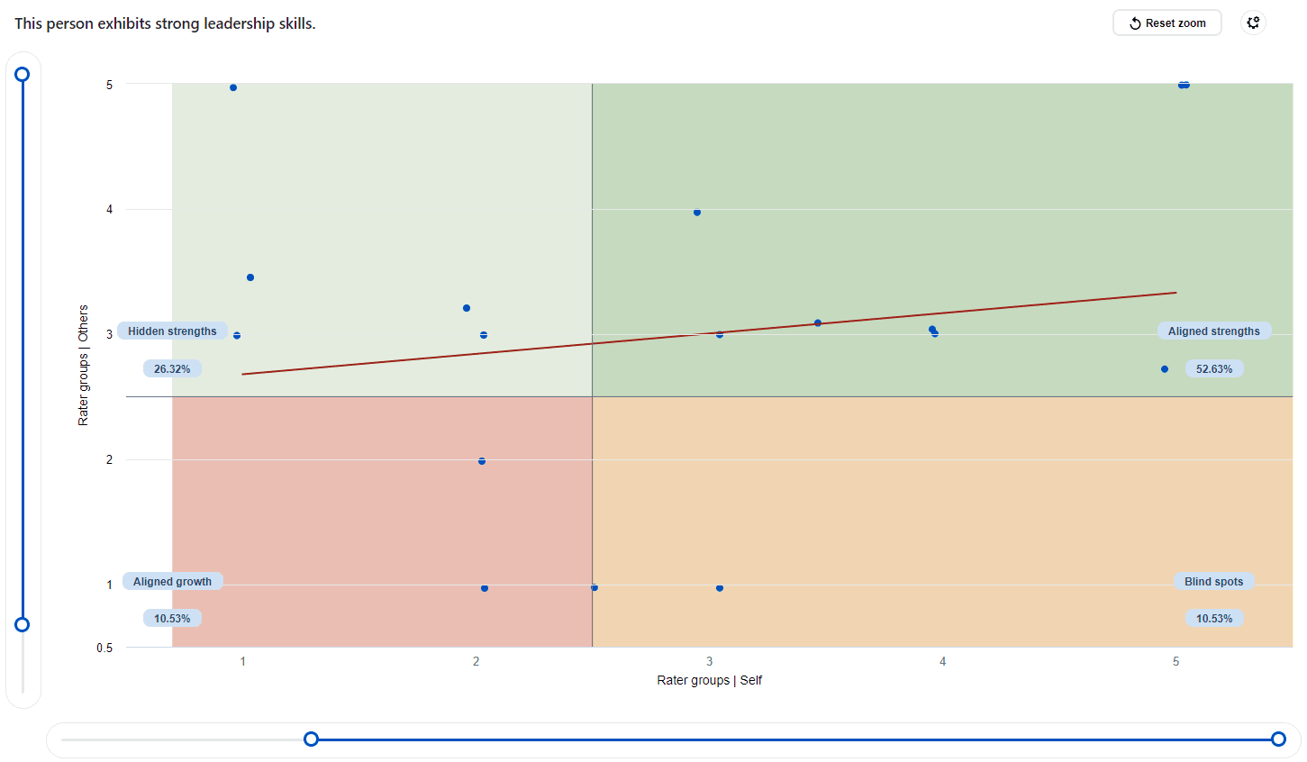
- Linear regression - add a best fit linear line between the two variables (x-axis and y-axis values).
- Maximize/Minimize - toggles between a large display and a small display.
- Dividers - enable any of the dividers you would like to use, set the corresponding value using the text box or the slider. The scatter plot view supports up to two X-axis dividers and two Y-axis dividers, dividing the scatter data into specific areas and indicating the percentage of data allocated to each area.
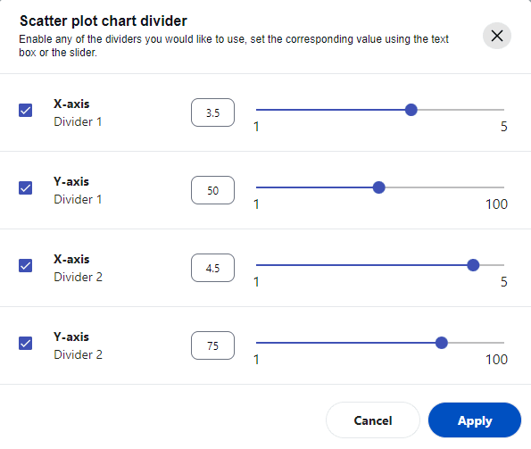
- Highlight areas - when the end user enables this option they can add a background color and text to specific regions of the scatter chart. This allows the user to add special meaning to a areas of the chart (see scenario 1 and 2 below for practical examples). End users can create customized highlights according to their own needs.
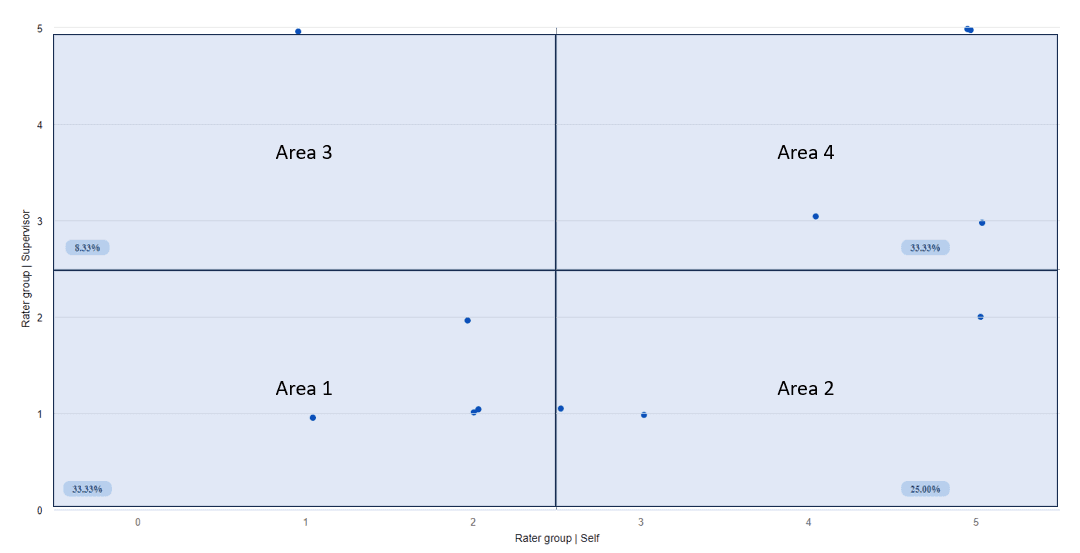
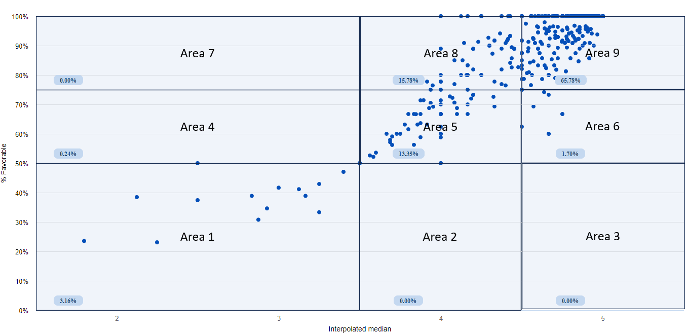
- Available on the scatter chart there are up to 2 X-axis dividers combined with 2 Y-axis dividers, meaning there can be anywhere between 2 divided areas and 9 divided areas depending on how the dividers are placed.
- The labeling of these areas are numbered from left to right and bottom to top. For example, Area 1 is referring to the bottom left area, Area 2 is referring to the area just to the right of Area 1. If there is no area on the right side of Area 1, Area 2 will be the leftmost are above Area 1. See the diagrams below for more examples.
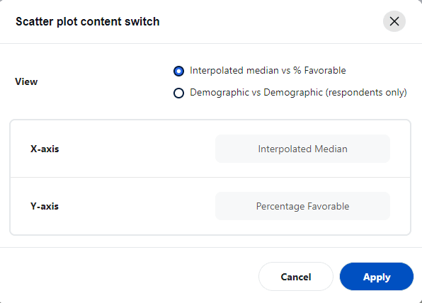
- Content switch - change views between interpolated median vs % favorable and demographic vs demographic
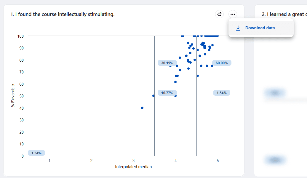
The scatter plot has the ability to download the displayed data in a CSV file. This feature supports highlighted areas when exporting data.
Scatter plot charts can be used to identify insights when measuring data from Likert scale questions:
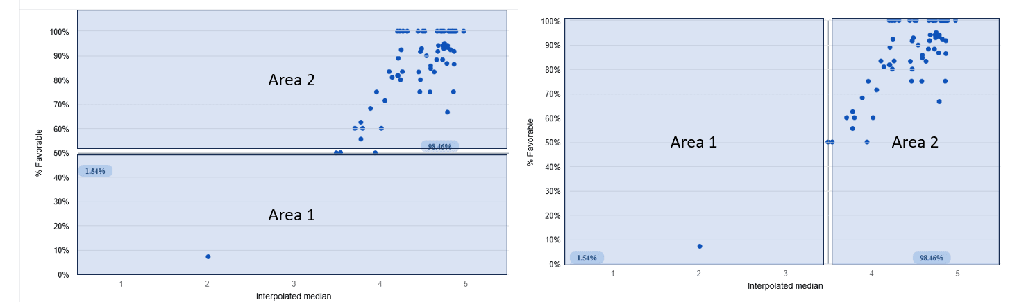
Scenario 1 - Interpolated median vs % Favorable
Blue Dashboard, designed for analyzing survey response data, presents the scatter plot chart with Interpolated median vs % Favorable as the default view. This unique approach measures the central tendency for balanced Likert scale questions, specifically those with balanced scales such as 5 or 7-point Likert type scales where the middle point is neutral. This methodology of reviewing feedback data was inspired by the research paper "Proposed metrics for summarizing student evaluation of teaching data from balanced Likert scale surveys".
For example, if we display a question with a 5-point Likert scale, the scatter plot chart can be divided into nine areas using dividers. Five of these areas hold significance, representing Subpar ratings, High potential, Outstanding, Polarizing, and Top ratings.
The characteristics of five of the nine areas defined by the default dividers are:
- Subpar ratings - an area with interpolated median less that 3.5 and a percentage favorable less than 50%
- Top ratings - an area with interpolated median larger than 4.5 and a percentage favorable better than 75%
- Outstanding - an area with interpolated median between 3.5 and 4.5 with a percentage favorable better than 75% (the typical characteristics of the this area tend to be more 4s selected than 5s).
- Polarizing - an area with interpolated median larger than 4.5 and a percentage favorable between 50% and 75%. (typical characteristics of this area tend to involve around 25% selecting 3 or lower and the rest selecting the highest option.)
- High potential - an area with an interpolated median between 3.5 and 4.5 and a percentage favorable between 50% and 75%.
Abdel Azim Zumrawi & Leah P. Macfadyen (2023) Proposed metrics for summarizing student evaluation of teaching data from balanced Likert scale surveys, Cogent Education, 10:2, DOI: 10.1080/2331186X.2023.2254665
Scenario 2 - Demographics vs. demographics
If the dashboard includes respondent demographics, users can utilize an alternative view of the scatter plot chart to observe contrasting opinions between two groups of demographics. For instance, comparisons like Self vs Others, Males vs Females, or Freshmen vs Seniors. Dividers, combined with linear regression, can be employed to analyze the scatter plots and gain insights from the data.
Subject - Details
When selecting a subject, a comparison of all question responses is presented allowing users to view detailed information about a subject. There are three tabs for each subject.
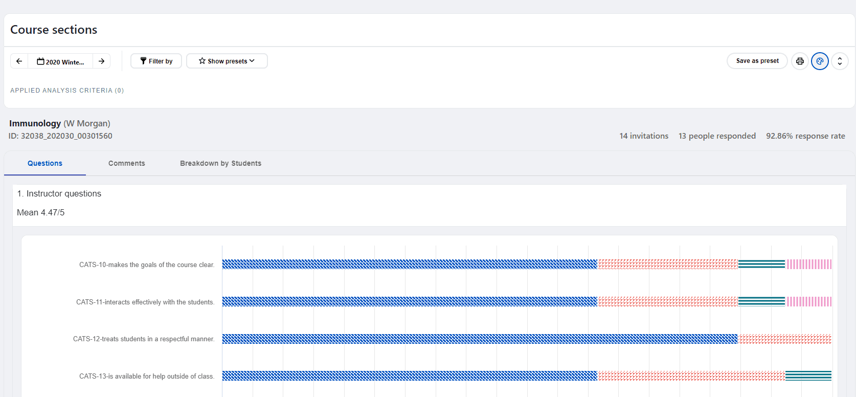
- Question group - Shows a comparison of all the questions and their statistics to determine a rating value.
- Comments - When there are open ended questions in a survey, the full comment is displayed in this section.
- Breakdown by respondent demographics - Shows the different respondent demographics made available by the administrator.
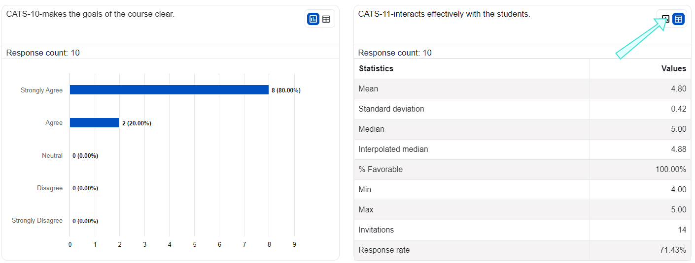
To see more information about a question, look at the subject detail view and find the question summary. Below the summary, you will find the question details. You can choose how to display the question details by using the toggle button. The toggle button lets you switch between a table view and a chart view.
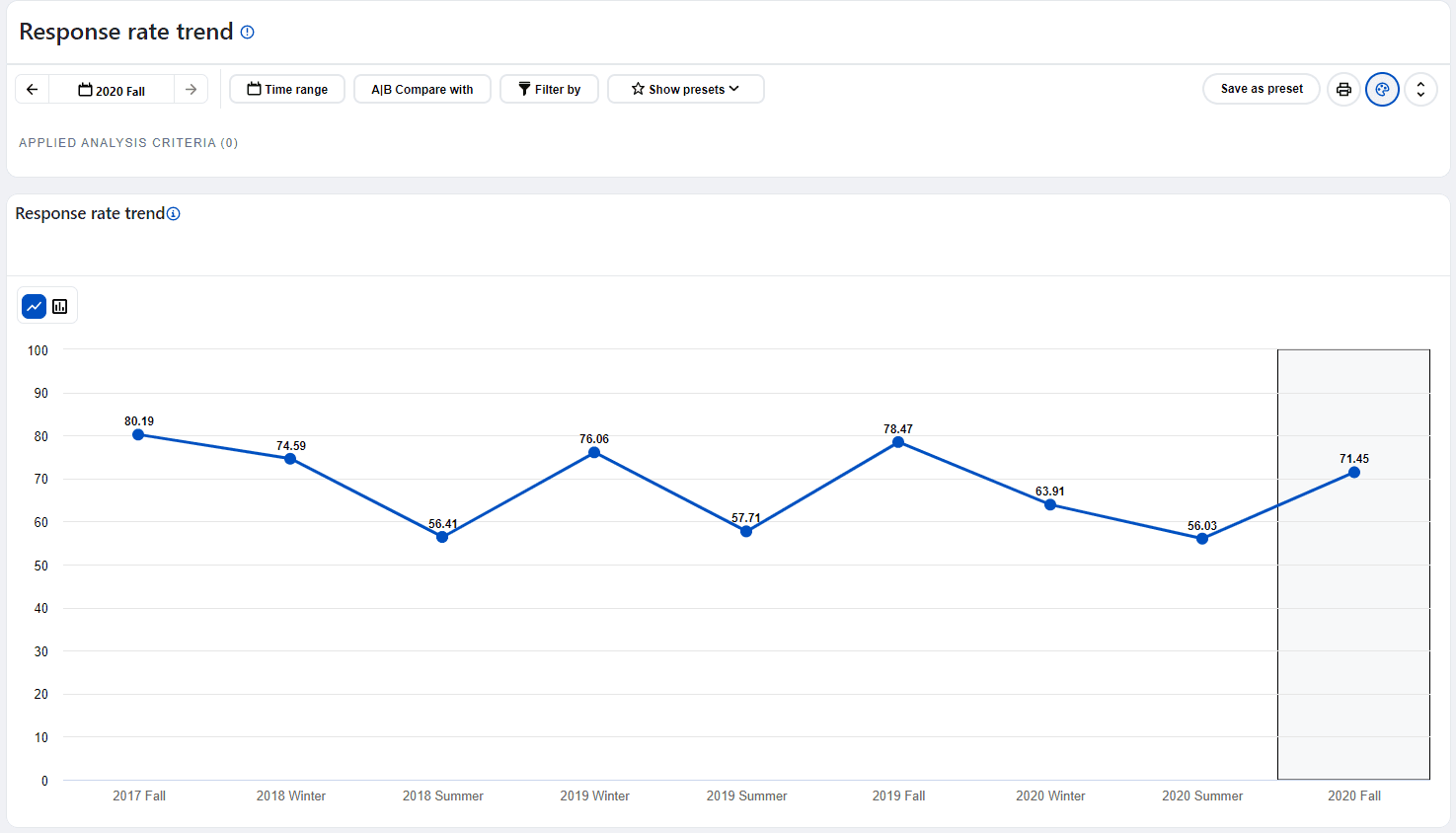
Response rate analysis dashboard view
When the response rate is chosen as the default statistic, the dashboard will change into the 'Response rate analysis dashboard' and no question level statistics and no drill down capability will be available while in this mode. Changing the default statistic will make the dashboard return to normal mode.
Filters and compare functions both work while in response rate analysis dashboard.
- Response rate is defined as response count divided by invitation count multiplied by 100.
- Filters/comparisons applied to the respondent demographics do not impact the invitation count
- Filters/comparisons applied to the subject or secondary subject demographics do impact the invitation count.
- Subjects that do not have any submitted responses are excluded from the invitation count on the response rate trend view chart.
- The aggregate dashboard only contains data selected from the data selection page.
- The dashboard only contains data from submitted responses.
- You might see "Threshold not met" in place of the data. A minimum number of responses is configured by the administrator to protect the identity of the respondents.
- The latest versions of Google Chrome, Microsoft Edge, Firefox, and Safari are supported.
- The pages are optimized for a minimal screen resolution of 1024 x 768.