Key Metrics Report (Ready Report)
Overview
Introduction to the Key Metrics Report
The Key Metrics Report provides insights into the following three areas:
- Estimated Performance Improvement (PI) - how much a learner’s performance improved due to training.
- Net Promoter Score (NPS)- how likely a learner is to recommend the learning experience.
- Scrap Learning - learning that is not applied back on the job.
These reports allow you to diagnose your courses' performance for a variety of training elements (e.g. courses, locations, instructors, learning methodologies, learning event types, etc.).
How can I use the Key Metrics Report?
The Key Metrics Report is specifically designed to give you insights into:
- The amount of training never implemented back on the job (an indication of learning application)
- How likely a learner is to recommend the program (an indication of perceived value)
- How much the learner’s performance will improve due to the training (an indication of business impact)
With this report, individuals at your organization can determine if the training you are providing is effective and having the desired level of value, on-the-job application, and impact. Because this report can be run to display the key metrics for various elements of your learning programs (ex. courses, learning methodology, portfolio, etc.), in addition to your reporting filters options (e.g. filter to specific demographics), you can easily identify where you may have performance gaps with the impact and value of learning. The report also enables you to compare your key metrics against a benchmark, providing insight into the effectiveness of your learning compared to other organizations.
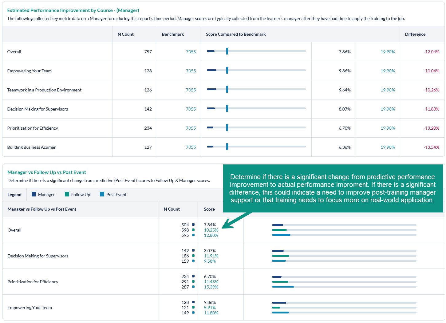
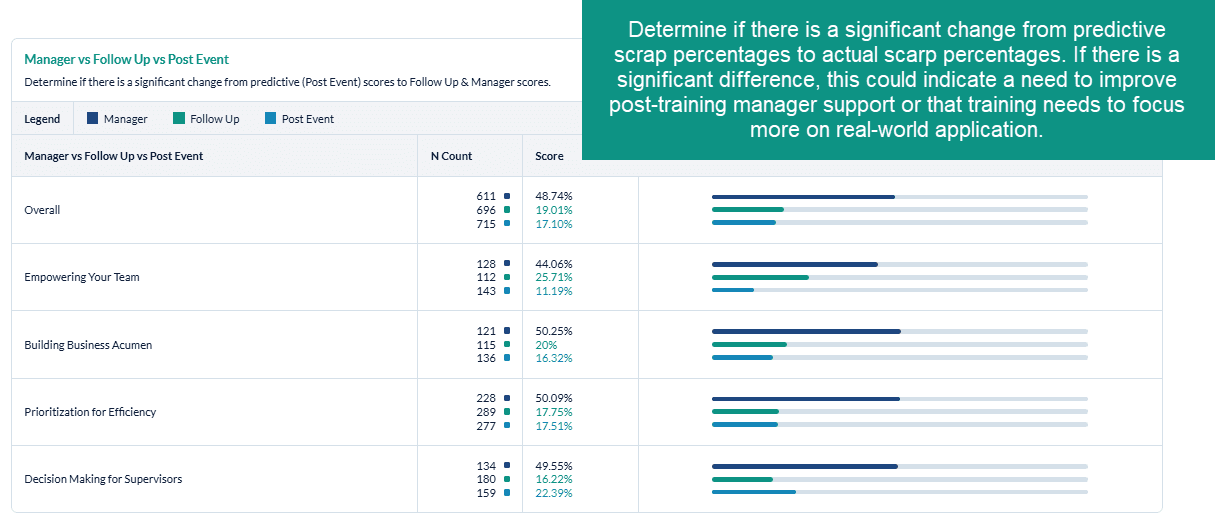
Additionally, comparing your key metrics from the Post Event to the Follow Up and / or Manager surveys will help you to understand if there was a significant difference between the predictive on-the-job application, value or impact (Post Event) vs. the actual on-the-job application, value, or impact (Follow Up and / or Manager). If you note a significant discrepancy between these measures, you could re-visit both the training content and the on-the-job support to ensure better on-the-job impact.
Who should use the Key Metrics Report?
Anyone at your organization who is responsible for analyzing training impact and driving continuous improvement in your learning programs can benefit from the Key Metrics Report. This report can be scheduled for automated delivery.
Job Aid
Estimated Performance Improvement Report
Introduction
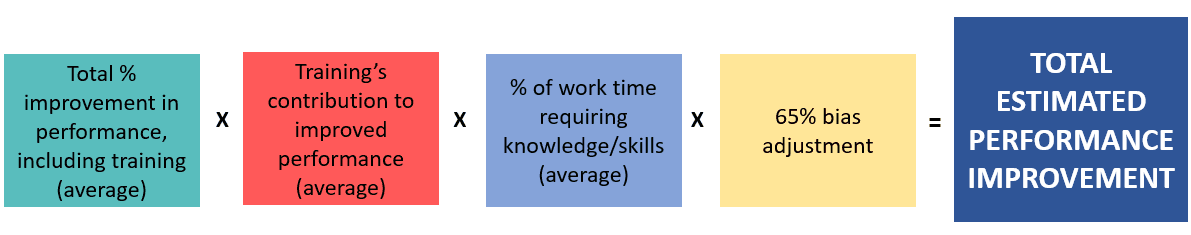
The Estimated Performance Improvement (PI) key metrics indicator (KPI) measures whether the training will improve the learner’s job performance and to what degree. Using human capital methodology, it also provides an indication of the percentage of performance improvement due to the training. This information will help you calculate ROI, as well as articulate the relative impact that training has had on a business outcome. This PI calculation is derived from Phillips' ROI calculation.
Estimated performance improvement represents what percent of a learner's time requires the skills or knowledge learned in the training, multiplied by the percentage of overall improvement in that particular area, multiplied by the percentage of improvement due to training as opposed to any other factors. We apply a bias adjustment of 65% to the improvement calculation, as research indicates that learners tend to overestimate their ability to apply training on the job on average by 35%. The bias adjustment ensures that your PI calculation is more conservative to hedge against overstating the impact of training.
PI is calculated using standard questions from the SmartSheets, followed by the 65% bias adjustment:
- The content is applicable to _% of my job x 65%
- Over time, my job performance in areas related to this content will improve _% x 65%
- I would attribute _% of my expected improvement to this learning experience x 65%
PI is a key learning metric that indicates whether or not learners' job performance improved as a direct result of training, referring to the impact of learning on the business.
Estimated performance improvement represents what percent of a learner's time requires the skills or knowledge learned in the training, multiplied by the percentage of overall improvement in that particular area, multiplied by the percentage of improvement due to training as opposed to any other factors. We apply a bias adjustment of 65% to the improvement calculation, as research indicates that learners tend to overestimate their ability to apply training on the job on average by 35%. The bias adjustment ensures that your PI calculation is more conservative to hedge against overstating the impact of training.
Specifically, PI is calculated using standard questions from the SmartSheets, followed by the 65% bias adjustment:
The content is applicable to _% of my job x 65%Over time, my job performance in areas related to this content will improve _% x 65%I would attribute _% of my expected improvement to this learning experience x 65%
PI is a key learning metric that indicates whether or not learners' job performance improved as a direct result of training, speaking to the impact of learning on the business.
For the Estimated Performance Improvement Report to populate, your organization must ask the following questions on your MTM surveys:
Post Event SmartSheet Survey
Pre-2017 Version:
- How much of your total work time requires the knowledge and skills learned in this training? (Question ID: 1423]
- How critical are the knowledge and skills you learned in this training to your success on the job (0% = not at all, 100% = extremely critical)? {Question ID: 1279]
- How much of this training do you plan to use on your job? [Question ID: 2788]
2017 Version:
- The content is applicable to _% of my job [Question ID: 518232]
- Over time, my job performance in areas related to this content will improve _% [Question ID: 518233]
- I would attribute _% of my expected improvement to this learning experience [Question ID: 518234]
Follow Up SmartSheet Survey
Pre-2017 Version:
- What percent of your total work time have you spent on tasks that require the knowledge / skills presented in the training? Check only one. [Question ID: 1737]
- On a scale of 0% (not at all) to 100% (extremely critical), how critical was applying the content of the training to your job success? Check only one. [ Question ID: 1738]
- What percent of new knowledge and skills learned from this training did you directly apply to your job? Check only one [ Question ID: 2818]
2017 Version:
- The content is applicable to _% of my job [Question ID: 521464]
- My job performance in areas related to this content has improved _% [Question ID: 521465]
- I would attribute _% of my improvement to this learning experience [Question ID: 521466]
If these questions (both post event and follow up) are not on your survey(s), then your Estimated Performance Improvement Report will not populate with data.
If you need assistance adding these questions to your survey please contact your MTM support team.
How can I use Estimated Performance Improvement (PI) Report?
The Estimated Performance Improvement Report is specifically designed to give you insights into how much learners' performance will improve / has improved as a result of training. With this report, individuals at your organization can determine if the training you are providing is effective and having the desired level of on-the-job impact. Because this report can be run to display the key metrics for various elements of your learning programs (ex. Courses, Learning Methodology, portfolio, etc.), in addition to your reporting filters options (e.g. filter to specific demographics), you can easily identify where you may have performance gaps within your training programs. The report also enables you to compare your key metrics against a benchmark, providing insight into the effectiveness of your learning compared to other organizations.
Additionally, comparing your key metrics from the Post Event to the Follow Up survey will help you to understand if there was a significant difference between the predictive on-the-job impact (Post Event) vs. the actual on-the-job impact (Follow Up). If you note a significant discrepancy from the Post Event to the Follow Up survey, you will most likely want to re-visit both the training content and the on-the-job support to ensure better impact from training.
How is the Estimated Performance Improvement Report organized?
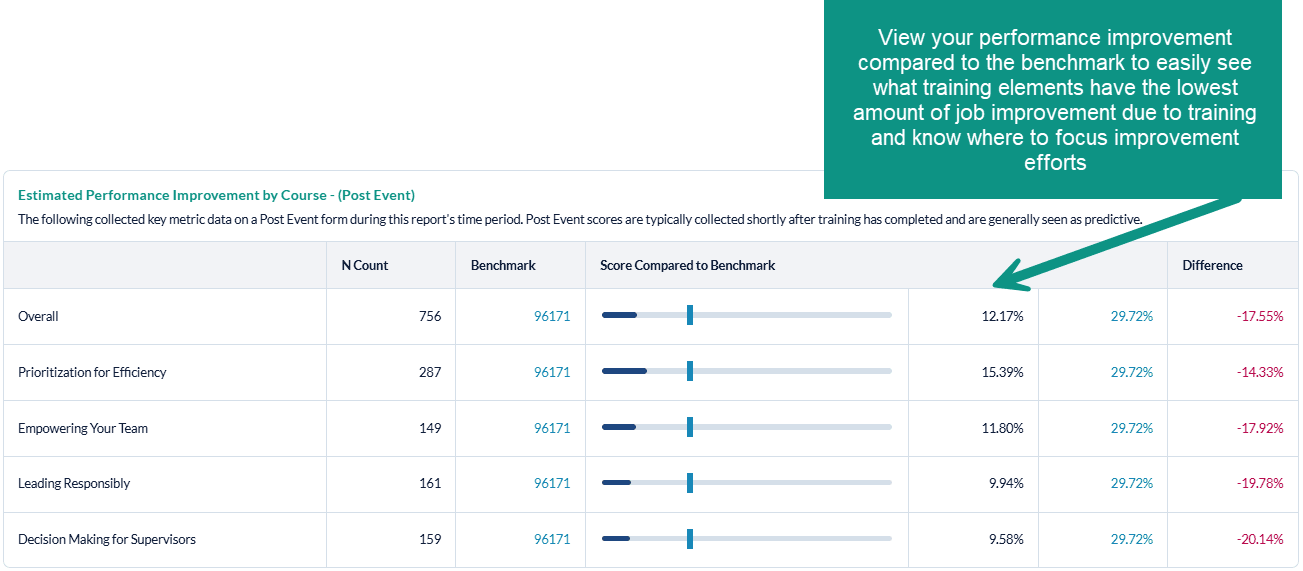
The Estimated Performance Improvement (PI) Report will display your Post Event and Follow Up PI percentage for each training element (ex: PI by course will show PI for each course) in horizontal bar graph format, compared to the selected benchmark. For each training element, you will also see the n-count, meaning the number of surveys collected within your organization that contain the PI questions, as well as the number of surveys in the benchmark group that also collected data against the appropriate question(s). To the right of the bar graphs, you will see the Percent Improvement percentages displayed, as well as the percent difference from the benchmark. For performance that is below the benchmark (meaning that your metric is lower than the benchmark - which is what you want to see), the difference will display in green. For performance that is above the benchmark (meaning that your metric is higher than the benchmark), the difference will display in red.
Whatever form types you selected to include in the report will be displayed, starting with Post Event data, then Follow Up Data, and finally a comparison between Post Event and Follow Up data. Note that the Follow Up vs. Post Event analysis does not include a benchmark comparison; rather, it displays the Follow Up Percent Improvement percentages compared to the Post Event Percent Improvement percentages.
The final portion of the Estimated Performance Improvement Report is the Trend Graph. This Graph will contain the previous last 6 or 12 months data from the date range of your report. Example: Report was run for Jan 1-Dec 31, 2021, The trend line will contain data for:
6 months: July-Dec 2022
12 Months: January-December 2022
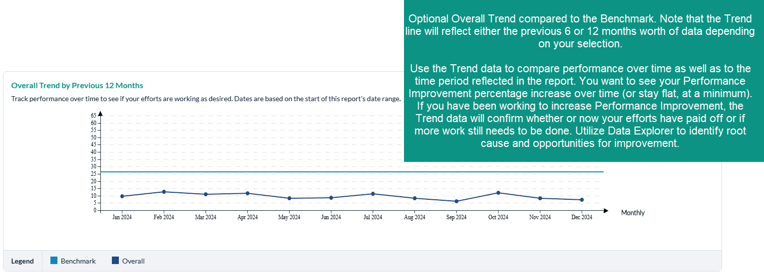
Trending is not available for custom ranges.
What should I do when we have low Estimated Performance Improvements scores?
First, we recommend that you determine which courses and/or programs are the most strategic to your organization: which courses should have the highest level of job impact? If you note low levels of performance improvement with these courses, you should focus your improvement efforts here first. Otherwise, focus your improvement efforts on the courses and/or training elements with the lowest levels Performance Improvement.
Net Promoter Score Report
Introduction
The Net Promoter Score (NPS) Report can provide insights into how likely learners are to recommend the training. The Net Promoter Score Report allows you to diagnose how likely learners are to recommend your training based on course(s), locations, learning methodologies, learning event types (formal learning, overall conference and conference sessions), instructors and more!
For the Net Promoter Report to populate, your organization must include the following questions in your surveys:
Post Event SmartSheet Survey
- Pre-2017 Version : How likely are you to recommend this learning experience to a colleague? [Question ID: 358398]
- 2017 Version : How likely are you to recommend this learning experience? [Question ID: 76509]
Follow Up SmartSheet Survey
- Pre-2017 Version: How likely are you to recommend this learning experience to a colleague? [Question ID: 358398]
- 2017 Version : How likely are you to recommend this learning experience? [Question ID: 521769]
If you need assistance adding these questions to your survey please contact your MTM support team.
How can I use net promoter score Report?
The Net Promoter Score Report is specifically designed to give you insights into how likely the learners are to recommend the training to others, an indication of perceived value. With this report, individuals at your organization can determine the likelihood of learner recommendation. Because this report can be run to display the NPS score for various elements of your learning programs (ex. Courses, Learning Methodology, portfolio, etc.), in addition to your reporting filters options (e.g. filter to specific demographics), you can easily identify where learners are likely - or less likely - to recommend the training. The report also enables you to compare your NPS against a benchmark, providing insight into how the NPS score of your learning compares to other organizations. Additionally, comparing your NPS from the Post Event to the Follow Up survey will help you to understand if there was a significant difference between the immediate perceived value (Post Event) vs. the actual value on the job (Follow Up). If you note a significant discrepancy from the Post Event to the Follow Up survey, you will most likely want to re-visit both the training content and the on-the-job support to ensure higher NPS and value.
How is the Net Promoter Report organized?
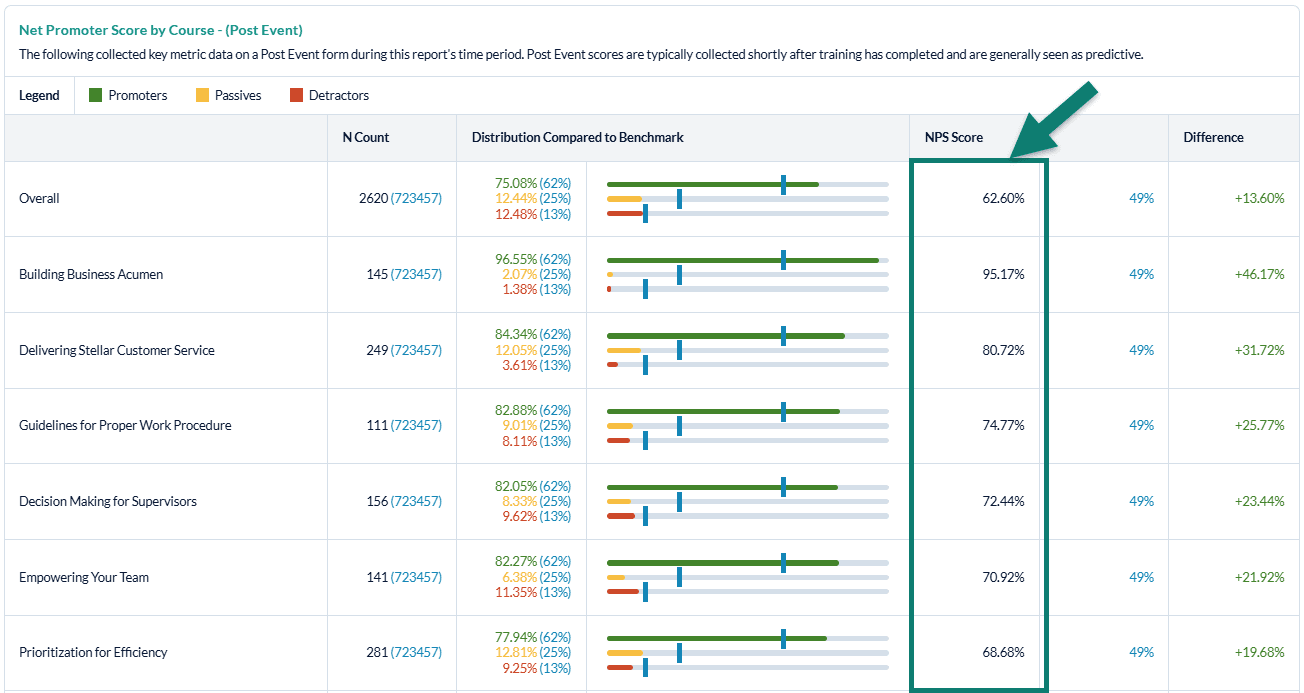
The Net Promoter Report will display your Post Event Net Promoter Score percentage for each training element (ex: NPS by course will show NPS for each course) in horizontal bar graph format, compared to the selected benchmark. User can also choose to include NPS scores from their follow up and/or manager surveys in their Key Metrics Reports, just like the Scrap and Estimated Performance Improvement metrics. For each training element, you will also see the n-count, meaning the number of surveys collected within your organization that contain the NPS question, as well as the number of surveys in the benchmark group that also collected data against the appropriate question(s). To the right of the bar graphs, you will see the NPS score displayed, as well as the percent difference from the benchmark. For performance that is above the benchmark, the difference will display in green. For performance that is below the benchmark, the difference will display in red.
Net Promoter is a measurement system that is very successful as an overall satisfaction measure. The score derived from this metric helps to provide focus regarding training elements that are performing well and where improvement may be warranted.
NPS is based on a 0 - 10 point scale and is calculated as:
- Promoters = 9 and 10
- Passives = 7 and 8
- Detractors = 0 thru 6
NPS is an indication of the perceived value of training (Would you recommend this training to others?). If you have a low NPS:
- Use Data Explorer and other detailed reports to identify contributing factors, then focus improvement efforts in these areas
- Use Data Explorer to conduct a demographic analysis to determine if certain groups are not perceiving value in the training they attend
- Run a custom Quick Question Report to see the breakdown of Promoters, Passives, and Detractors to determine how much work needs to be done to increase overall NPS (e.g. if there are a large majority of Detractors, more efforts might need to be made)
View your NPS compared to the benchmark to easily see what training elements have the lowest NPS and know where to focus improvement efforts
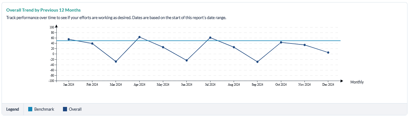
Optional Overall Trend compared to the Benchmark.
The Trend line will reflect either the previous 6 months’ worth of data or the previous 12 months’ worth of data, depending on your selection.
Use the Trend data to compare performance over time as well as to the time period reflected in the report. You want to see your NPS increase over time (or stay flat, at a minimum). If you have been working to increase NPS, the Trend data will confirm whether or not your efforts have paid off or if more work still needs to be done. Utilize Data Explorer to identify root cause and opportunities for improvement.
What should I do when we have low Net Promoter Scores?
First, we recommend that you determine which courses and/or programs are the most strategic to your organization: which courses should have the highest level of job impact? If you note low Net Promoter Scores with these courses, you should focus your improvement efforts here first. Otherwise, focus your improvement efforts on the courses and/or training elements with the lowest Net Promoter Scores.
Scrap Learning Report
Introduction
The Scrap Learning Ready Report provides insights into learning that is not applied back on the job. Scrap learning can come from a number of sources:
- Content that is not relevant to the jobs of the learners
- Learners who already know the information being presented
- Content that isn't sufficiently practical
- Content that's delivered at the wrong time
- Inadequate support outside class for applying the training
The Scrap Learning report allows you to diagnose areas within your learning programs with the most waste and gives you the ability to analyze scrap for your courses, locations, learning methodologies, learning event types (formal learning, overall conference and conference sessions), instructors, and more (via the filtering options). Additionally, this report enables you to compare scrap from the post event survey to the follow up survey and to compare your scrap learning percentage against a relevant benchmark.
For the Scrap Learning report to populate, your organization must be collecting data on the scrap learning questions (tied to the "Job Impact" question category):
Post Event SmartSheet Survey
- Pre-2017 version: "What percentage of new knowledge and skills learned from this training do you estimate you will directly apply to your job? Check only one." [Question ID: 2788]
- 2017 version: "I will use ___ % of this content on the job." [Question ID: 518230]
Follow Up SmartSheet Survey
- Pre-2017 version: "What percent of new knowledge and skills learned from this training did you directly apply to your job? Check only one." [Question ID: 2818]
- 2017 version: "I have used ___ % of this content on the job." [Question ID: 521462]
If one of these questions (for both Post Event and Follow Up) is not on your surveys, then your scrap learning percentages cannot be calculated.
If you need assistance with adding the scrap learning question(s) onto your surveys, please contact your MTM support team.
How can I use the Scrap Learning Report?
The Scrap Learning Report is specifically designed to give you insights into the amount of training that is never implemented back on the job. With this report, individuals at your organization can determine if the training you're providing is effective and having the desired level of on-the-job application. Because this report can be run to display scrap for various elements of your learning programs (ex: scrap by course, scrap by learning methodology, scrap by portfolio, etc.), in addition to all your reporting filter options (e.g. filter to specific demographics), you can easily identify where you may have performance gaps with training application. This report will also enable you to compare your scrap learning against a benchmark, providing insight into the effectiveness of your learning compared to other organizations.
Additionally, comparing your scrap learning percentages from the Post Event to the Follow Up survey will help you to understand if there was a significant difference between the predictive on-the-job application vs. the actual on-the-job application. If you note a significant discrepancy from the Post Event to the Follow Up survey, you will most likely want to re-visit both the training content and the on-the-job support to ensure better learning application.
How is the Scrap Learning Report organized?
Scrap Report Default Settings
- Date Range: : current month.
- Minimum number of evaluations:: N count of 30 evaluations. This default setting matches the default minimum setting for the Scrap Rate Dashboard Widget found on your instant insights tab.
Dashboards are only available to clients that have purchased this module as part of their solution.
- Form Type: : Post Event Survey, and Follow Up Surveys are selected.
- Benchmark: : your specific user account benchmark. This can be found under Administration > Reporting Tools > Benchmark.
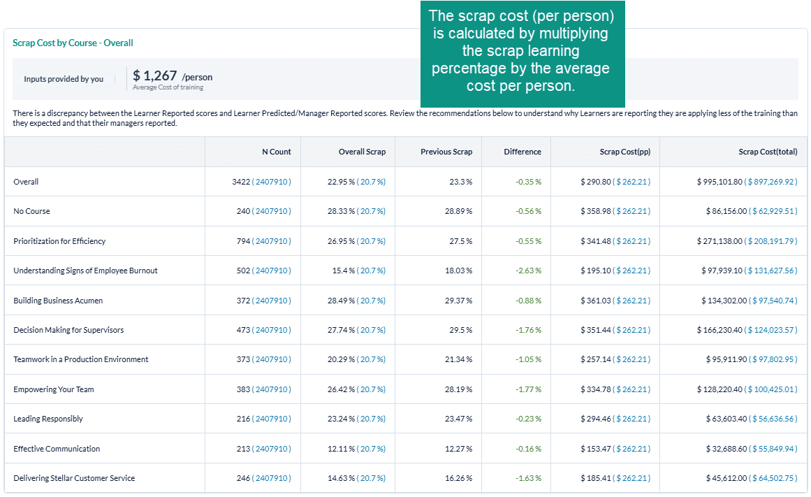
- Average Cost : $1267. This default setting is based on the ATD Average cost of training per employee. This value may differ if an organization specific defualt has been provided.
All of these default settings can be modified before you execute your report.
The Scrap Learning Report will display the scrap cost for each training element (ex: scrap learning by course will show the scrap cost for each course) compared to the selected benchmark. The scrap cost will be displayed as the cost per person and the total scrap cost for the training element. For each training element, you will also see the n-count, Scrap Learning percentages, the previous scrap learning percentage, and the difference between the current and previous scrap learning scores.
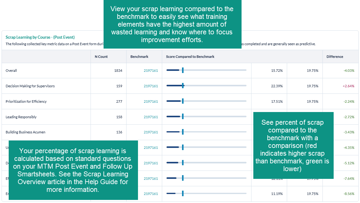
The Scrap Learning Report will display your Post Event and Follow Up scrap learning percentage for each training element (ex: scrap learning by course will show scrap for each course) in horizontal bar graph format, compared to the selected benchmark. For each training element, you will also see the n-count, meaning the number of surveys collected within your organization that contain the scrap learning question, as well as the number of surveys in the benchmark group that also collected data against the scrap learning question. To the right of the bar graphs, you will see the scrap learning percentages displayed, as well as the percent difference from the benchmark. For performance that is below the benchmark (meaning that your scrap is lower than the benchmark - which is what you want to see), the difference will display in green. For performance that is above the benchmark (meaning that your scrap is higher than the benchmark), the difference will display in red.
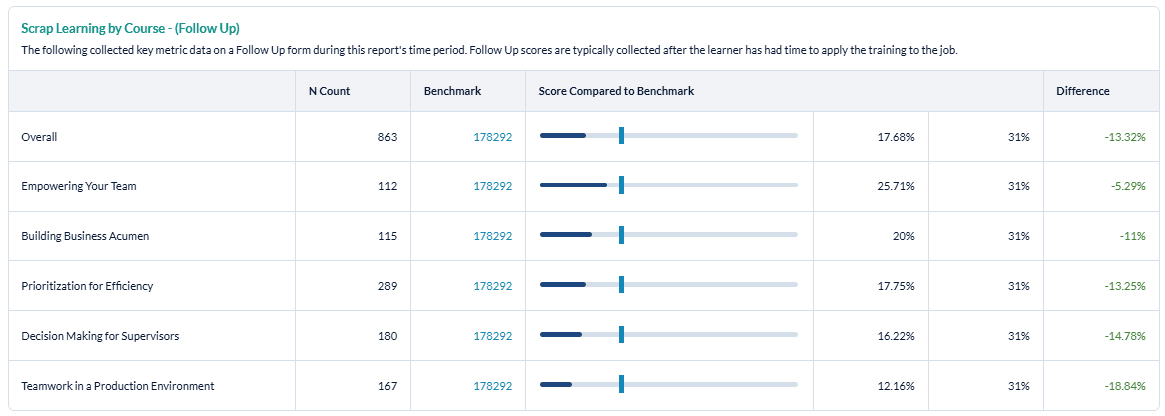
Whatever form types you selected to include in the report will be displayed, starting with Post Event data, then Follow Up Data, and finally a comparison between Post Event and Follow Up scrap learning. Note that the Follow Up vs. Post Event analysis does not include a benchmark comparison; rather, it displays the Follow Up scrap learning percentages compared to the Post Event scrap learning percentages.
The final portion of the Scrap Learning Report is the Trend Graph. This Graph will contain the previous last 6 or 12 months data from the date range of your report. Example: Report was run for Jan 1-Dec 31, 202, The trend line will contain data for:
- 6 months: July-Dec 2021
- 12 Months: January-December 2021
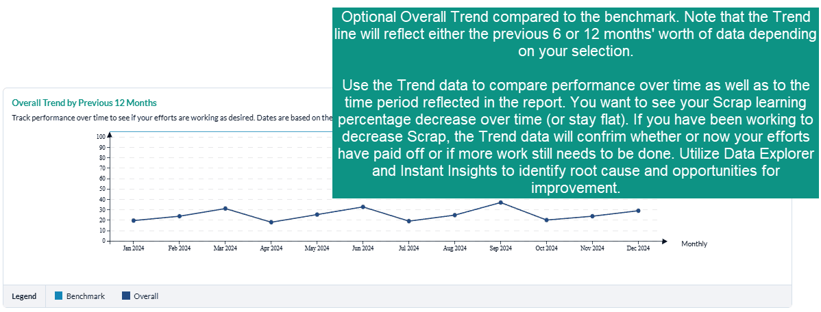
Trending is not available for custom ranges.
What should I do when we have high scrap learning percentages?
First, we recommend that you determine which courses and/or programs are the most strategic to your organization: which courses should have the highest level of job impact? If you note higher levels of scrap with these courses, you should focus your improvement efforts here first. Otherwise, focus your improvement efforts on the courses and/or training elements with the highest levels of scrap learning.
Step-by-step instructions
Create and view a Key Metrics Report
- Navigate to Reporting > Reporting.
- Select Ready Reports.
- Click on the Key Metrics icon.
KEY METRICS
- Expand the Key Metrics section.
- Select your Date Range.
- In the Metric field, select one of the following key metrics options for your report:
a. Estimated Performance Improvement
b. Net Promoter Score (NPS)
c. Scrap Learning - Modify your Minimum number of evaluations, if needed.
- Customize your Report Name to easily locate this report for future use.
- In the Report By field, select one of the following filters from the drop-down menu:
a. Business Unit
b. Channel
c. Client
d. Conference
e. Course
f. Event
g. Instructor
h. Learning Methodology
i. Learning Provider
j. Location
k. Portfolio
l. Region - Select one or multiple Form Types options for your report. By default, all form types are selected. Click the check box beside any of the form types if you wish to deselect it.
a. Post Event
b. Follow Up
c. Manager - Click Include Overall Trend, if you wish to include a trend graph in your report.
- Select a trend timing option from the drop-down list:
a. 6 months (this trend will use the previous six months)
b. 12 Months (this trend will use the previous 12 months)
BENCHMARK
- This report includes a Benchmark comparison based on your default Benchmark setting. To modify the Benchmark comparison for this instance of the report, expand the Benchmark section.
- Click Change.
- In the Benchmark Settings pop-up window, select a new Benchmark.
- Select Optional Benchmark Attributes for your report, if needed.
- Click Apply.
FILTER
- This report allows you to select filters that will narrow down the set of data that is included in your report. To add filters, expand the Filter section.
- Click ** Create New Filter**
- In the Filters pop-up window, select a filter by clicking Add beside one of the options.
- A list of the options for that filter will be displayed. At the top of the pop-up window, enter a name for this filter in the Filter Name field.
- Click the check box beside each Filter option that you wish to use for your report.
- Click Apply
- Repeat the last 2 steps to add multiple Filters to your report, if needed. Be sure to click Apply after each selection to save your filter.
- Click Save. The new filters will appear in the Saved Filter list at the bottom of the screen, checked for use with this report.
A Single Use Filter allows you to filter the data of the report that you are currently preparing to run.
The Saved Filters are available for all reports throughout your MTM account.
- Click Run Report.
Schedule and distribute Key Metrics Reports
To schedule a Key Metrics Report, you must first run your report or return to a previous Key Metrics Report.
- To access your Key Metrics Report:
a. Click on the icon at the top right of your report and select Schedule from the drop-down menu, or
b. Click on the Report Queue tab, locate a previously created Key Metrics Report, click on the icon and select Schedule for the drop-down menu.
 - In the Schedule Report Name field, customize the name of your report to easily locate it for future use.
- Select a Query Date Range
a. Dynamic Dates - your report query will be based on the predefined range selected from the drop-down menu. This is the most commonly used selection.
b. Original Dates - your report query will be based on the original date range you used to generate your report. This would make your scheduled report a static report. - Select the Frequency of Report Delivery from the drop-down menu.
- Select the End Frequency to determine how long your report will be automated, or how many reports you will receive. Once the occurrence is over, you will stop receiving reports and will need to reschedule this report to continue receiving it.
- Select a date for the First Report Delivered On field which represents the date the automated reports will begin. If you backdate a report, you will receive every instance of that report that would have previously been generated.
- Send reports to:
a. Me - Select this option to send the automated report to yourself. b. Other Recipient(s) - Enter the email addresses of each recipient, separated with a semicolon ( ; ). c. Course Report Recipient(s) - Select this option to send the report to individual Course Report Recipients (CRR) who should receive this report. Click the check box and Select All, or select specific CCRs from the drop-down list.
By selecting the Me option this report will be sent to the email associated with the account you are logged into. However, if you are impersonating another user, the report will be sent to that user's email.
- By default, the Subject field provides the Report Name preceded by the word Scheduled. This field can be customized by adding or changing the text to better identify the report for the report recipients.
- Body
the email by creating a message that explains why you are sending this report and what the users should do with it. - Select Add Image to make your emails more visually appealing and aligned with your own organization’s brand by adding an image or logo to your email.
- From the Select Image pop-up window,
- Select or search for an existing image or logo in the Library tab or
- Click on Browse in the Upload tab to locate the image on your computer, network or shared drive and click Upload.
- Select a format for the Attachments by clicking the radio button beside either PDF or Excel.
- Select Include DE link to include a direct link in the email message that allows individuals to further analyze the data contained in the report using Data Explorer.
To access Data Explorer, the individuals must have a Reporting user license that includes Data Explorer.