Customize the look and feel of your form
Customize the look and feel of your forms in BlueX with a great design which may improve response rates for your surveys
Design the layout after the questionnaire is built to easily see how the styles affect how your content will appear.
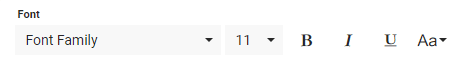
Format the text
Text can be formatted like you would in most text editors. A toolbar with standard text formatting options, such as Bold, Font family, and font size are available on the Main page.
Add media files to your questionnaire
The Insert tool ( ) allows you to add different types of media:
| ICON | TYPE | DESCRIPTION |
|---|---|---|
 | Link | Create a URL link in your document to quickly access a new web page. |
 | Image | Insert an image from your computer or another source. |
 | Video | Embed an online video. |
 | File | Insert a file from your computer or another source. |
To insert media to your questionnaire:
- Select the insert icon () from the toolbar on the Main page.
- Choose the media type you want to include:
- Select the link icon ()
- Type in the URL.
- Enter the displayed text to replace the URL.
- Enable Open in new tab if needed.
- Select the image icon ()
- Upload an image(
 ) from your computer.
 - Use an online image (
 ) by entering the URL.
- Upload an image(
- Select the media icon ()
- Use an online video by entering its URL().
- Use an online video by entering its embedded code(
 ).
).
- Use an online video by entering its URL(
- Select the file icon () to browse for a file from your computer.
- Select the link icon (
- Select Insert to finish.
After you have inserted media, modify it by using the editor with the available tools.
Customize media display
Once media has been added to the form, each media element has its own set of display options.
Link and file
- Select the inserted link.
- Open, update, or disable the link with the mini-tool.
- Select the box with an arrow icon to enable or disable the link to open in a new window.
- Select the box with a pencil inside to edit and update the link URL.
- Select the unlink icon to remove the link from the text.
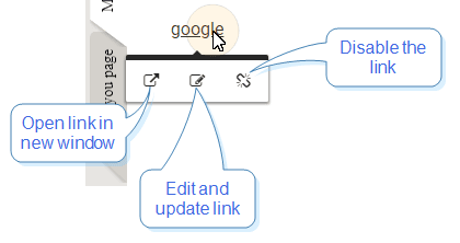
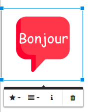
Image and video
- Select the star icon (
 ) to determine if text appears inline with the element or wraps at the top and bottom.
 - Select the vertical align icon (
 ) to set the vertical alignment of the element.
 - Select the information icon (
 ) to set the alternative text.
 - Select the trash icon (
 ) to delete the element.
Design and style the overall look of your form
Styling the form includes picking fonts for the heading and body, choosing a theme color, and adding a background. Get creative!
Access the Design window from your Form, by selecting the Design link on the top-right of the page.
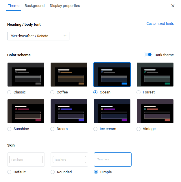
Choose a theme
The design settings you are choosing in your theme are the subtle things that give great personality to your page layout. Set the following:
- Heading/Body Font - BlueX suggests these font combinations for your headings (h1, h2, h3, etc) and the body text of the form.
- Select a font combination different from BlueX suggestions by clicking on Customized fonts.
- You can always manually change the font of your content by selecting the text and choosing a font from the editor.
- Color Scheme - Determines the color of buttons, containers, borders, and highlights. Choose from different color schemes and their dark background versions by toggling the Dark theme switch.
- Skin - Set whether you prefer boxes with straight or round corners, or a simplified look.
Theme fonts include:
- Merriweather
- Roboto
- Playfair Dispay
- Noto Sans
- Lora
- Open Sans
- Rokkitt
- PT Sans
- Merienda
- Olie Script
- Nobile
- Stardos Stencil
- Montserrat
- Alegreya
- Lobster
- Raleway
- Passion One
- Delius Swash Caps
- Kalam
- Arimo
Form editor fonts include:
- Roboto
- Arial
- Arial Black
- Georgia
- Impact
- Tahoma
- Times New Roman
- Verdana
- Courier New
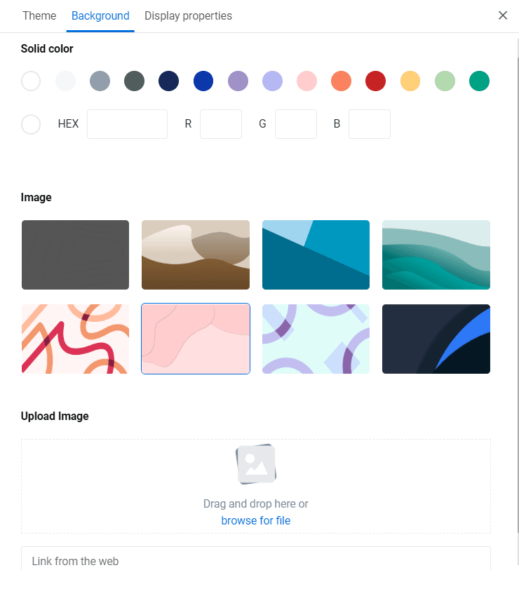
Set a background
While the theme defines the colors and style of your form, the background defines what will be behind the form. Choose from a solid color, BlueX suggested backgrounds, or upload (or link) to your own background image.
Configure display properties
The display properties allow you to brand and add features to your Form.
- Form title - Enter the title of the survey that participants will see. This title is located on the top of the page and included on every page of your survey.
- Logo - Next to the title, insert a logo or small image to brand your form. You can also link to that image with a URL instead of uploading it.
- Logo alternate text - Set the alternate text for the logo image (usually your brand name).
Questionnaire display options
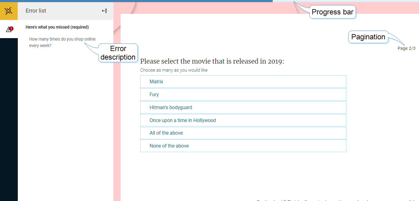
Enhance the survey experience by adding features that allow respondents to better track their progress.
Most of these features canèt be seen from within the form editor, so use the Preview option to view them.
- Progress bar - Add a bar above the survey form that provides a visual marker of how far along in the form that respondent has progressed.
- Error list - Show if any questions were missed or other mistakes were made. Respondents can select the error to navigate immediately to that question.
- Pagination - When your survey includes several pages, showing the number of pages (current page/total pages) is also a good indication of progress to participants.
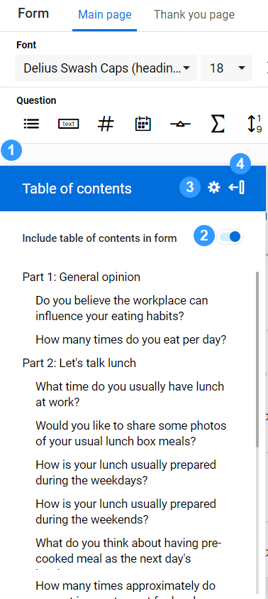
Insert a table of contents in your Form
The table of contents includes hierarchical titles that can be used for navigation. You can choose which headings you would like to include in your table of contents.
- Select the blue bookmark on the left-hand side of the Main page to expand the table of contents properties.
- Flip the toggle to enable the table of contents.
- Use the settings icon (
 ) to select what styles you want to include.
 - Collapse the table of contents with the icon (
 ).
).
After designing the look and feel for your Form, go to preview to review it.