Example chart report content in 360 multi-rater assessments
Reporting on the feedback is essential for key stakeholders in your organization to identify actionable items and make high-level decisions. Visualizations can draw attention to important areas in the data and lead you to insights. In this document, we will walk you through a variety of options for visualizing data in reports as well as the steps and requirements needed.
Before consulting this document, it is recommended to know the fundamentals of setting up a standard report. To learn more, see Create a new report.
About this document
- Only contains report content with chart visualizations.
- Primarily used in reports for 360 multi-rater assessments.
- Examples in this document are used solely in individual reports.
- To view report content with tabular visualizations, please refer to Example tabular report content in 360 multi-rater assessments.
Common Terms in 360 Multi-Rater Reporting
Datasource
Also known as a table or “view”, a datasource is a dataset that is applied towards a survey campaign. It can contain the survey respondent information, including employees’ names, email addresses and other demographic data that will be useful in the analysis (user datasource).
Report block
A report block is the container of data that generates specific types of content (tables and/or charts) in reports. For example, the Question report block presents response data for a specific question or set of questions while the Frequency report block displays the number of times a particular answer was selected.
Rollover report
A rollover report provides an overall aggregate calculation of all results collected for all subjects or secondary subjects in a project. They are useful if you want to get an overall aggregated view of survey results.
Individual report
Tailored for evaluating an individual person or thing, each stakeholder within an organization can receive their own custom report containing only response data relative to them.
Rater group
A rater group is comprised of members in the organization who have been assigned to complete the questionnaire and evaluate the subject (employee). Rater groups help to organize raters into groups relative to the subject to allow each group to rate the subject on specific criteria on the rater form as well as to better understand the results in reports. Some common examples of 360 rater groups are Self, Peers, Managers, Direct Reports, Clients, etc.
Rater selection
Rater selection is a privilege assigned to a group who can select the raters that will be participating in the subject review (limited to one group per definition).
Group elements
Group elements help to contextualize the results in a report and provide different methods of data calculations for each group in a project. They offer more granularity and greater flexibility in terms of displaying the data and, ultimately, help the report viewer to make sense of the data in a report. Some examples include the average of rater group element which will give the average for all rater group responses, and the breakdown by rater group element which enables the user to see the results broken down by each rater group.
Assessment period
An assessment period is the specific duration of time in which an employee is evaluated. Some common assessment periods are measured quarterly, yearly, monthly, etc.
Competency
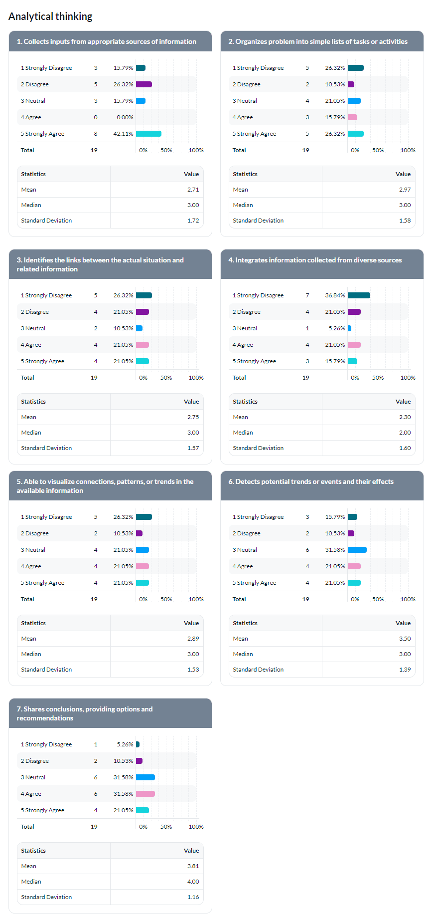
A competency is a grouping of questions evaluating the way a specific set of skills and behaviors are carried out by an employee. An example of a competency would be the single selection table question "Analytical thinking" which is followed by a series of statements that reflect on several different aspects of the competency.
Behavior
A behavior is the way in which someone acts or responds to particular situations in the workplace.
This information is applicable for all scales throughout this document
- Question Scale (Default) - Scale range is taken from the questions scale.
- Dynamic Scale - Scale range displayed in the chart is calculated based on the values of the actual responses.
- Custom Scale - Manually define the minimum and maximum ranges.
- Custom Markers - When custom scale is selected, enter custom captions for the minimum and maximum range.
Quantitative analysis
Analyze the response data using statistical calculations.
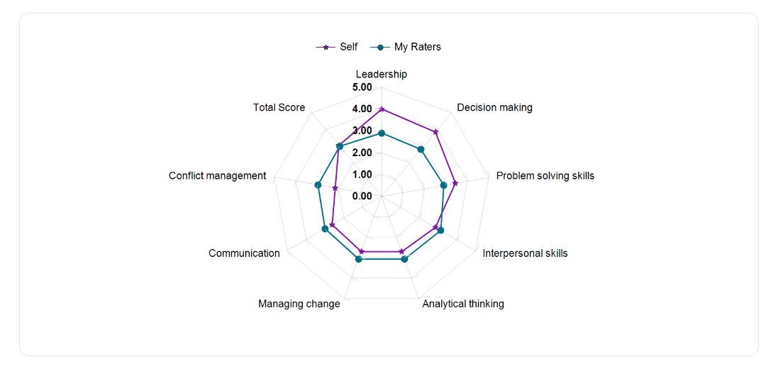
Summary results of competencies radar chart
Display the mean of responses per rater group for all competencies in a radar chart.
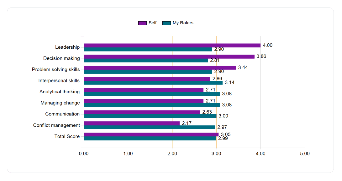
Summary results of competencies horizontal bar chart
Display the mean of responses per rater group for all competencies in a horizontal bar chart.
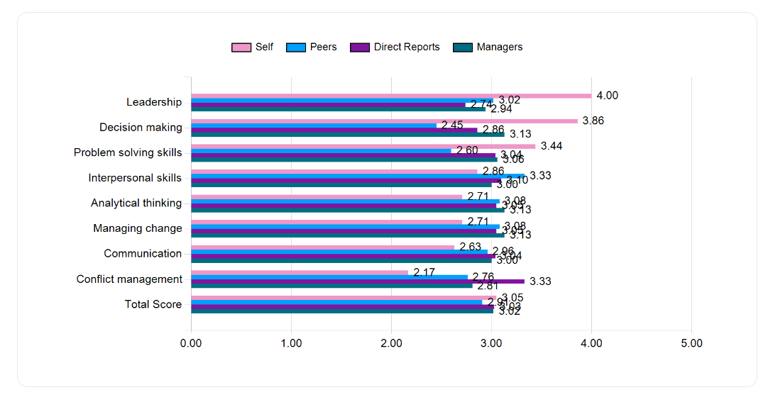
Summary results of competencies per rater group (version 1)
Display the mean of responses per rater group for all competencies broken down in one horizontal bar chart.
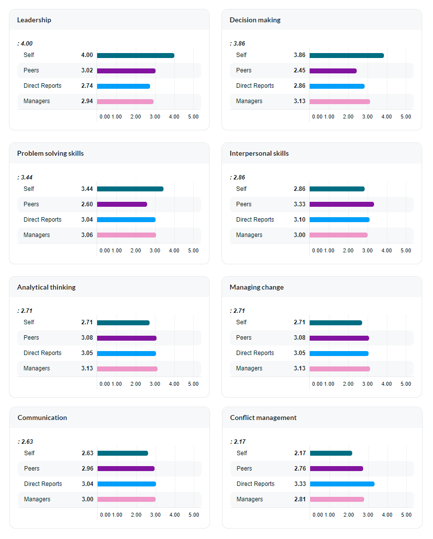
Summary results of competencies per rater group (version 2)
Display the mean of responses per rater group for all competencies broken down by multiple horizontal bar charts.
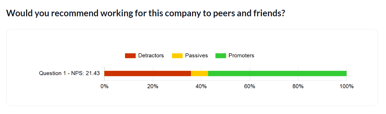
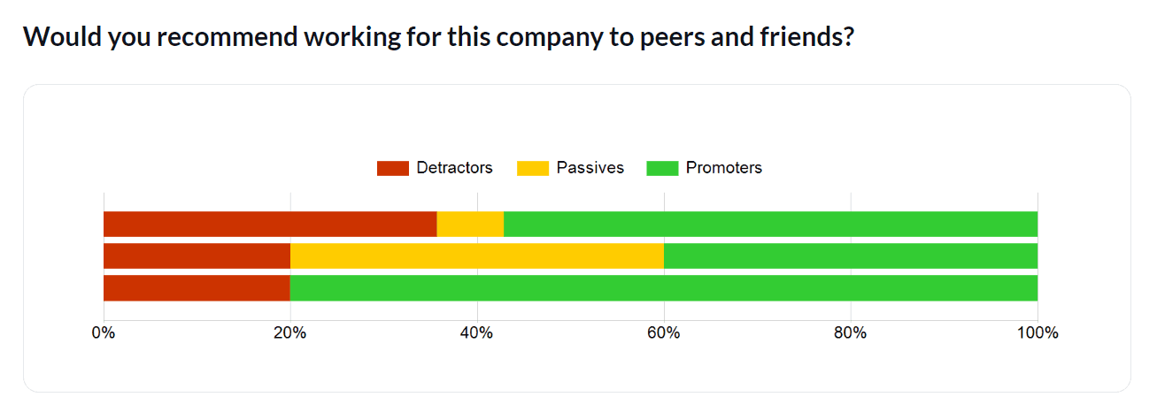
NPS question chart
Display the Net Promoter Score (NPS) which is a calculated value between the promoters (percent positive rating) and the detractors (percent negative rating) for a question.
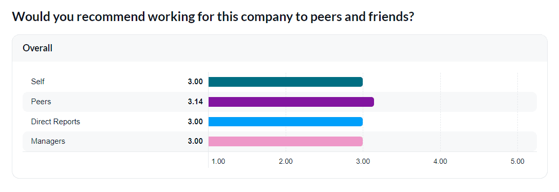
Question mean chart for single question
Display the mean of responses per rater group for a single question in a horizontal bar chart.
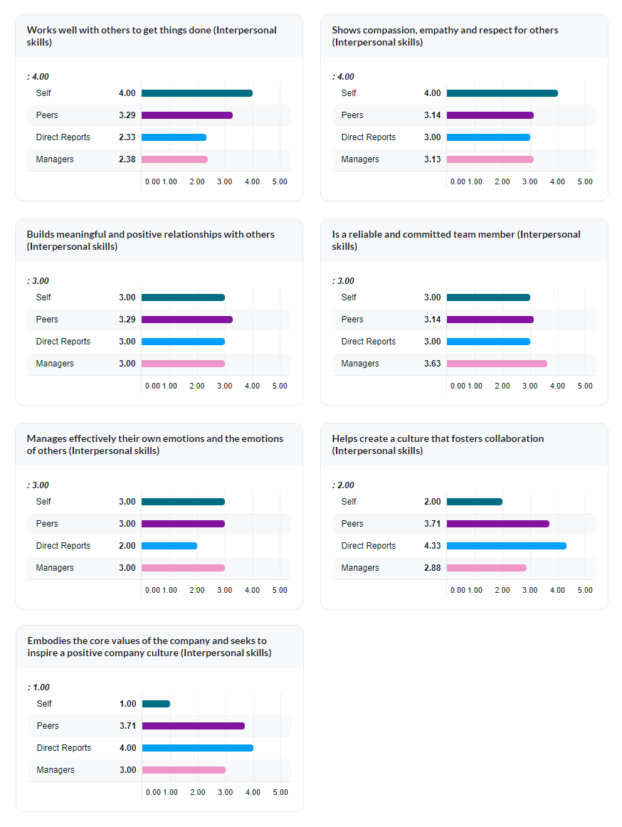
Question mean charts for a single competency (version 1)
Display the mean of responses per rater group for a single competency broken down by half-width horizontal bar charts.
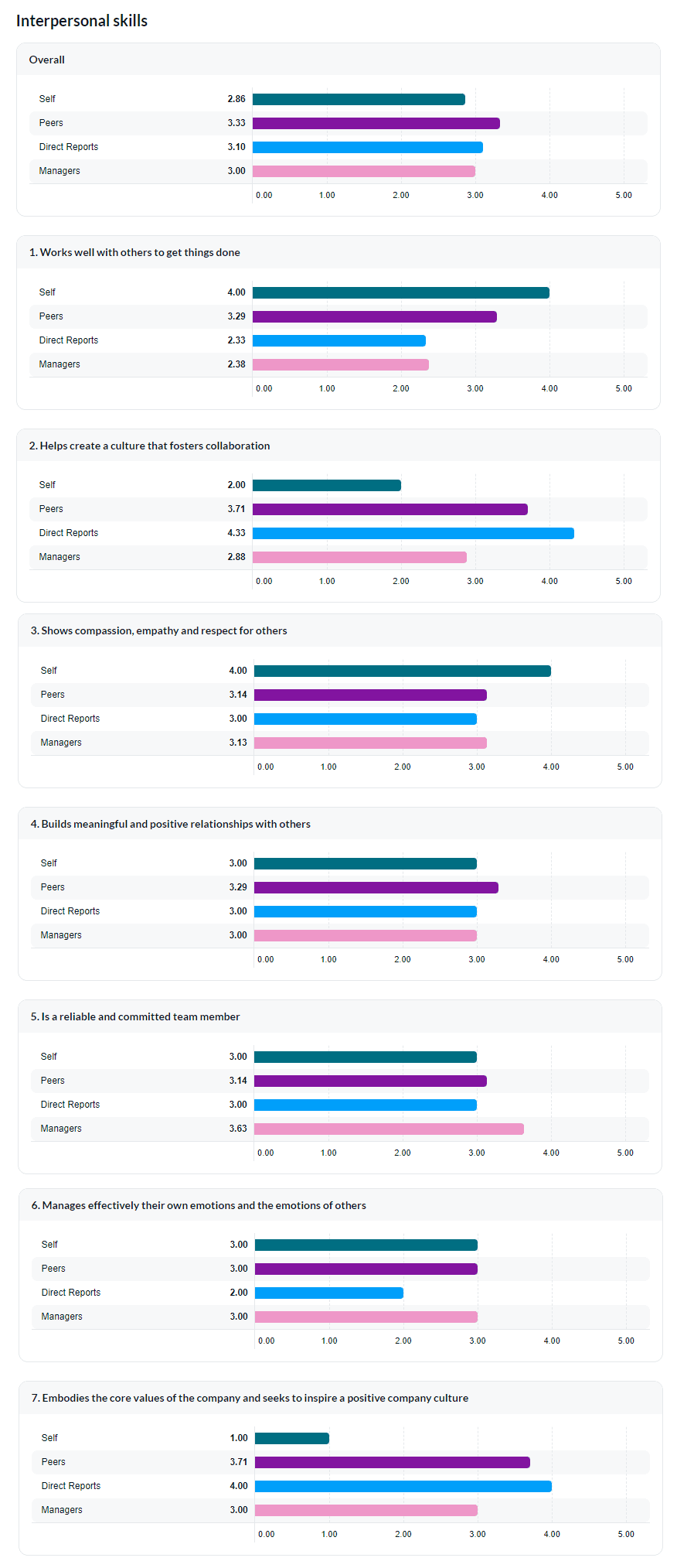
Question mean charts for a single competency (version 2)
Display the mean of responses per rater group for a single competency broken down by full-width horizontal bar charts.
Response frequency charts for a single competency
Display the frequency of responses and specific stats (mean, median, and standard deviation) broken down by charts for all questions in a single competency.
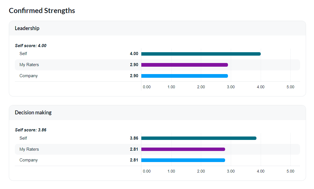
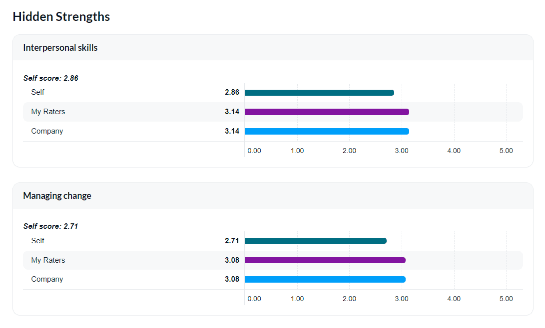
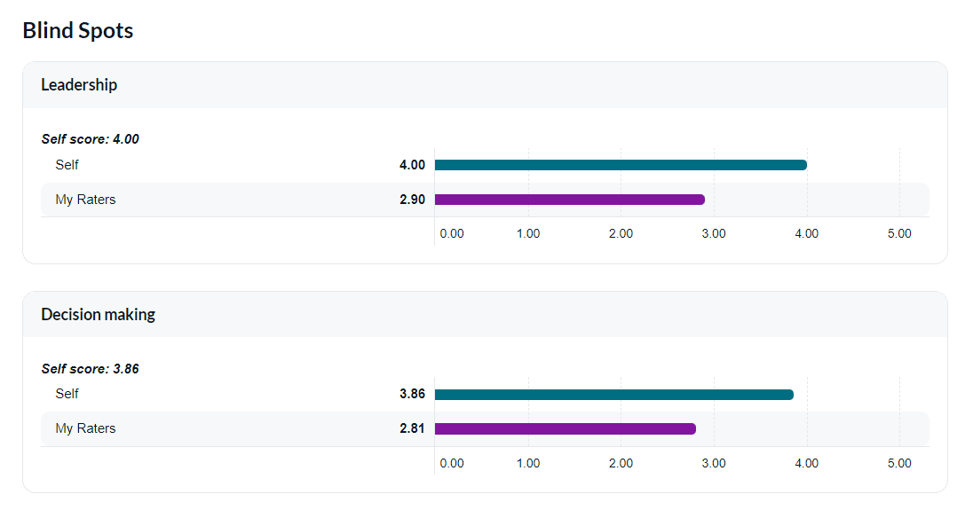
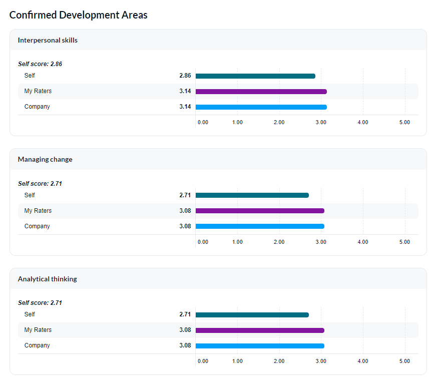
Johari window
Display the employee's strengths and challenges by comparing self-scores with the feedback provided by others analyzed in four quadrants: confirmed strengths, hidden strengths, blind spots, and confirmed development areas.
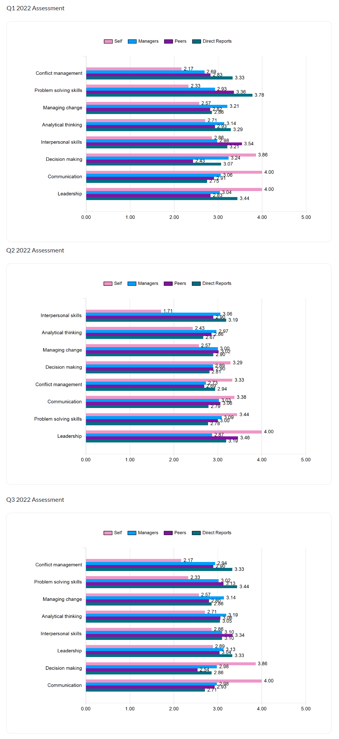
Trend analysis
In order to track and analyze trends between different assessment periods (quarters, years, etc.) in your organization, you will need to map all projects from each assessment period to a master project so that data can be analyzed and displayed together. This will provide you with unique insights to identify any trends in improvement.
Summary results of competencies per assessment period
Display the mean of responses per rater group for all competencies across different assessment periods.
Response frequency chart for single question per assessment period
Display the frequency of responses for a question in a horizontal bar chart per assessment period.
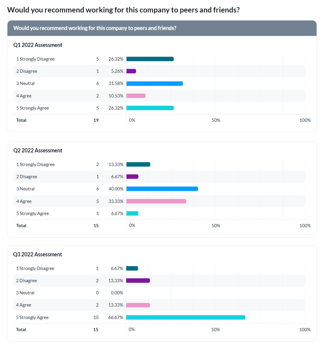
Agreement scale question chart per assessment period
Display the percent agreement scale for an agreement scale question represented in a horizontal bar chart per quarterly assessment.
To learn how to change report block colors for your agreement scale question chart, see Customize report block colors for group elements.